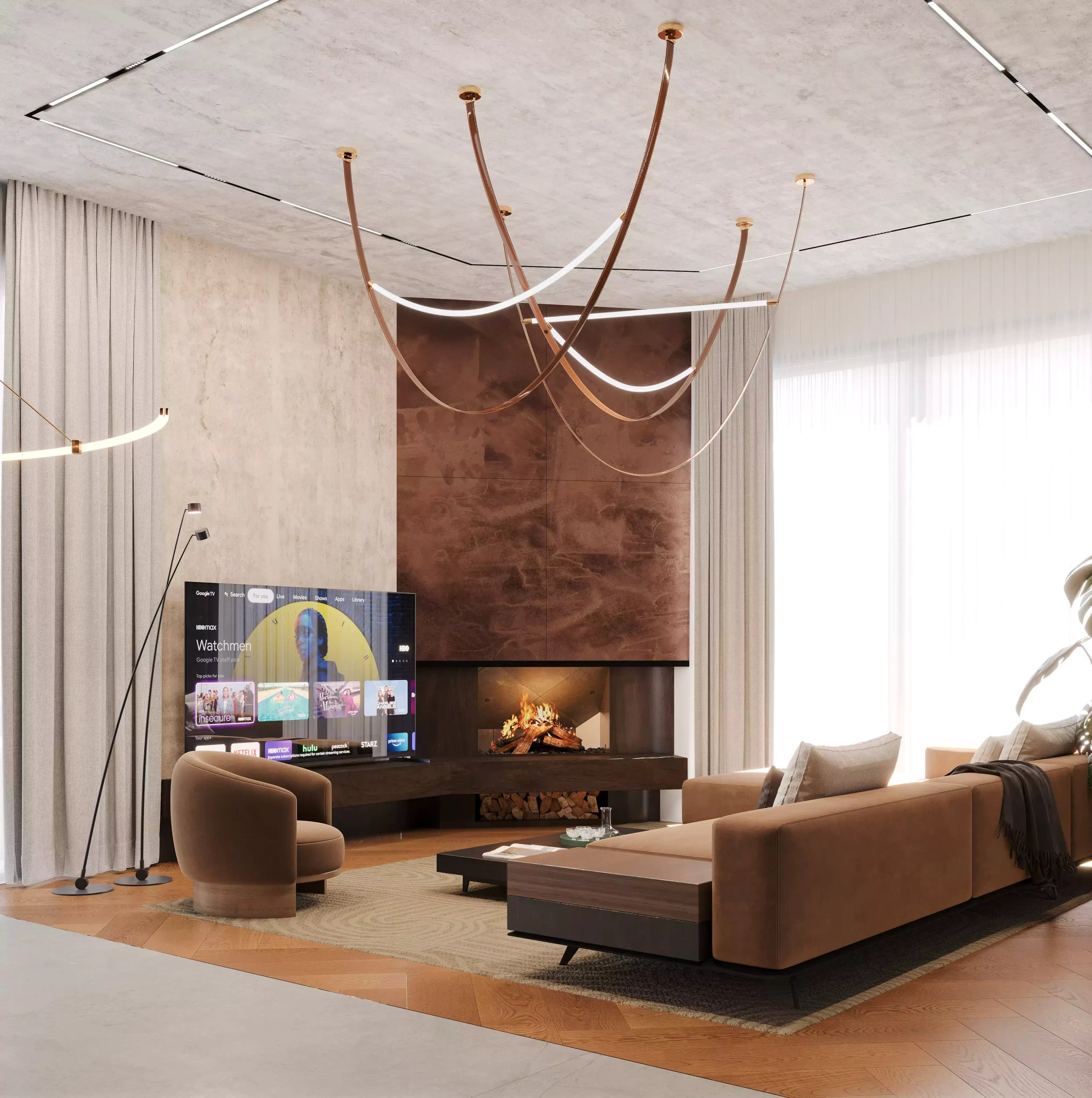
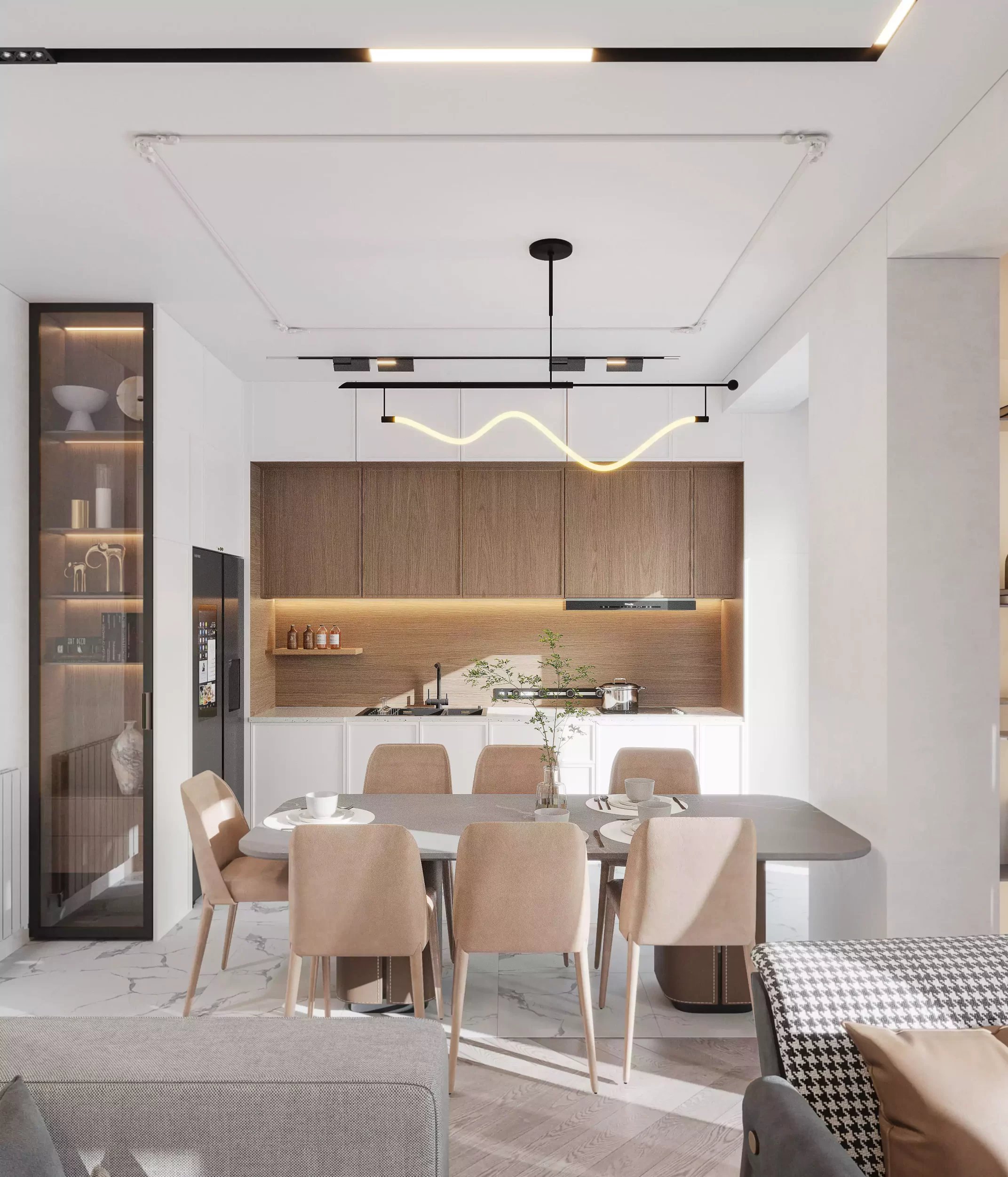
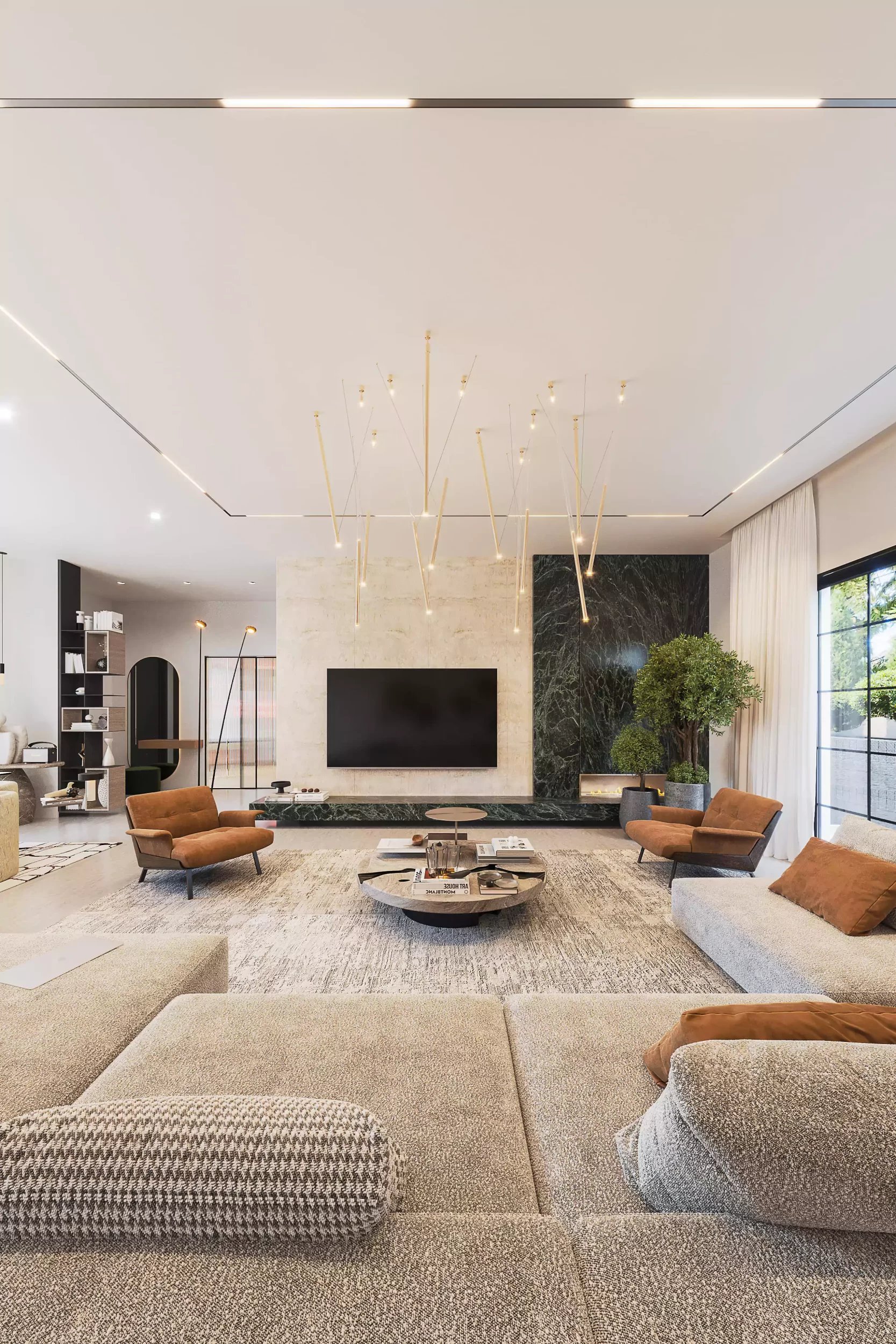
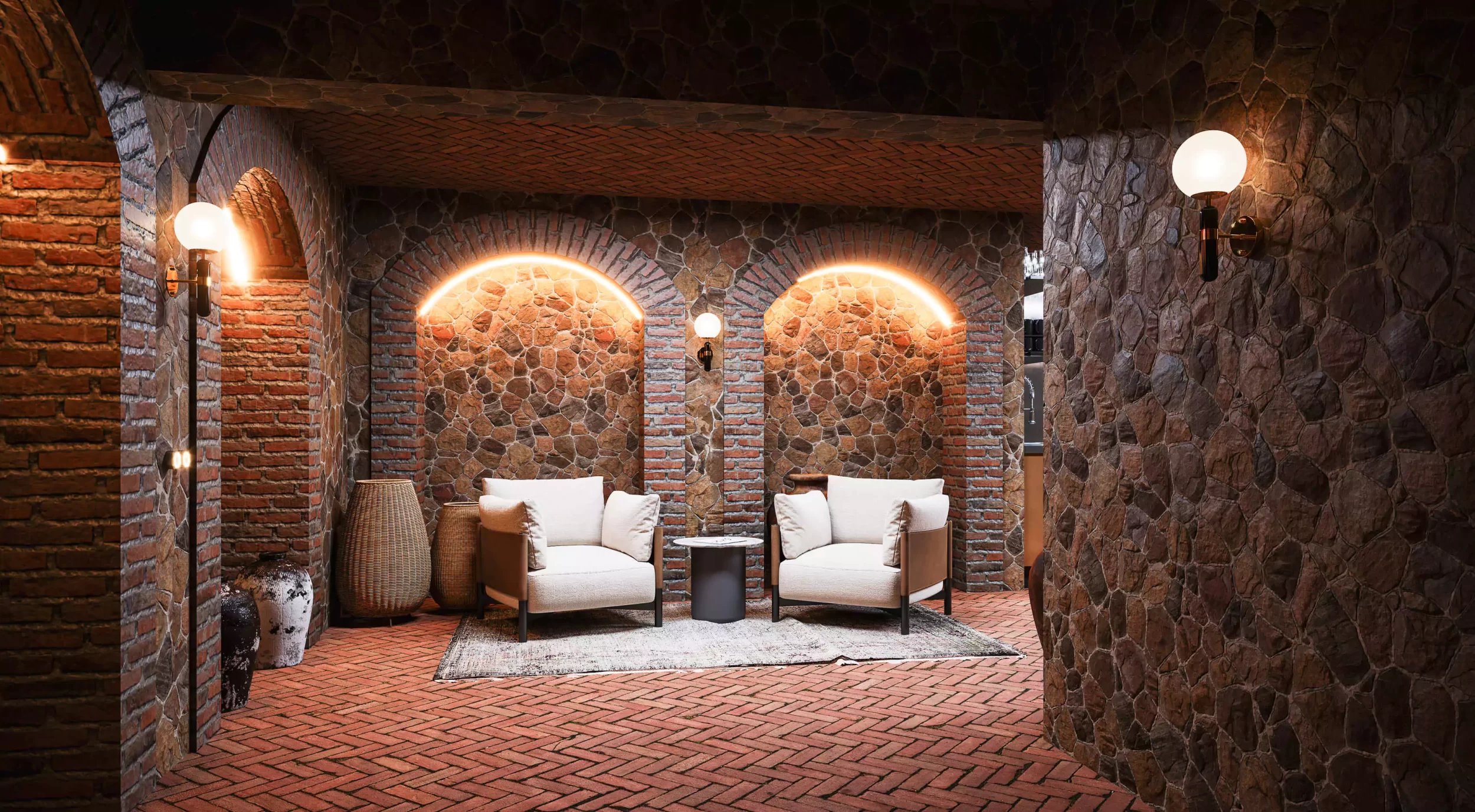
Interior
Barambo ice cream islands in shopping malls
- Category
- Interior
- Year
- 2024
- Location
- Tbilisi I "City Mall"-Gldani I "East Point"
01 - Challenge
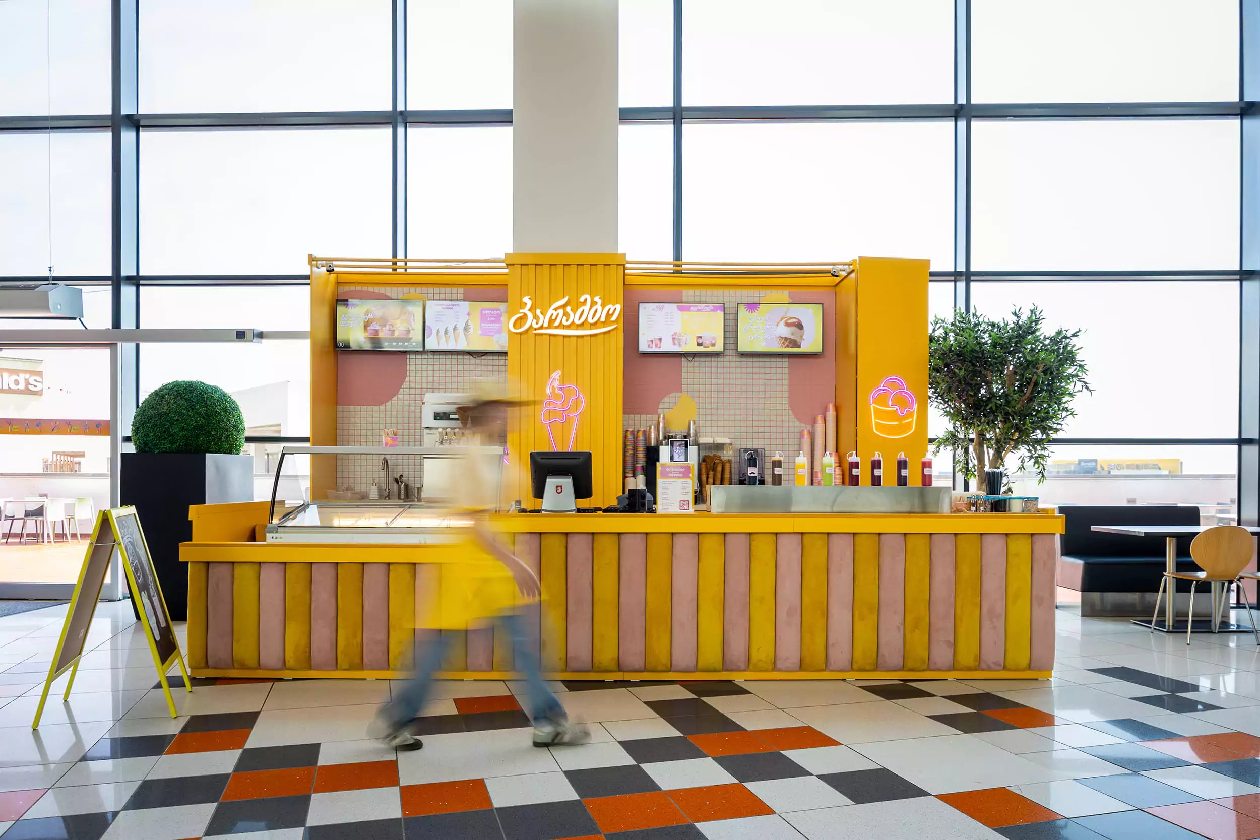
When a brand enters a shopping mall, the main challenge is always maintaining its identity in a large, chaotic space.
In the case of "Barambo", our goal was to create a shopping island design that would accurately replicate the cheerful character of a street shop, but would technically fit into the open spaces of "Gldani City Mall" and "East Point".
02 - Approach
This project is a clear example of how the same concept can be transformed into different architectural forms.
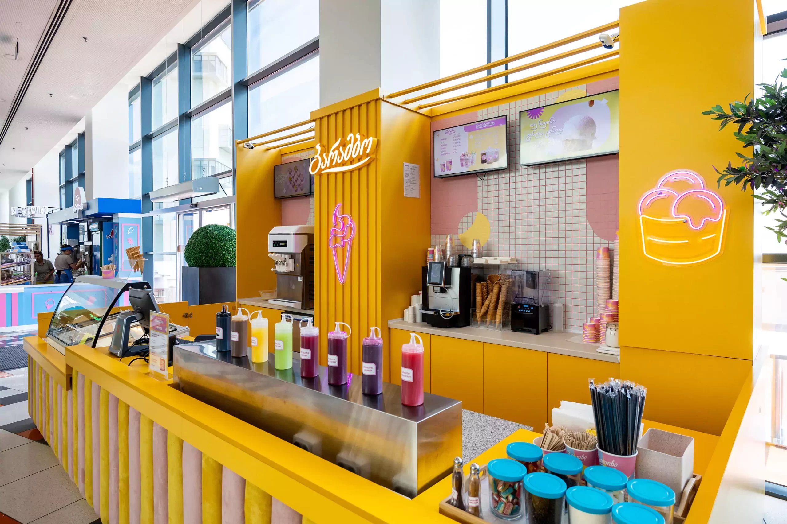
The visuals of the kiosks are based on the already familiar color scheme: dominant yellow and pink. However, the main emphasis here is on textures.
A vertical, rhythmic soft fabric is used on the counter facade, which adds visual height to the "island" and makes it more noticeable against the variegated background of the mall.
Neon lights and the logo are placed at strategic points to make the brand recognizable to a 360-degree traffic flow.
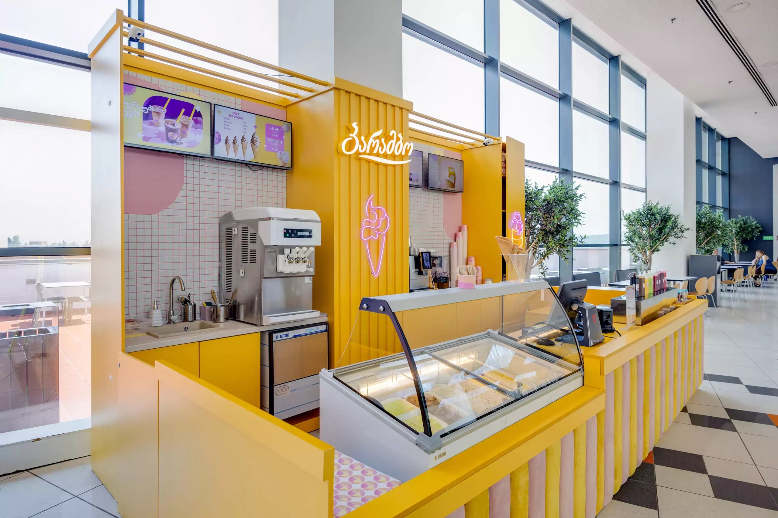
Working in shopping centers requires special standards.
The design of the shopping island was designed to maximize the use of a small area. Water supply systems, freezers and coffee machines are integrated inside the kiosk.
Ergonomics are designed for rapid movement of personnel, which is critically important during peak hours.
In the case of East Point and Gldani City Mall, the design takes into account the building's overall lighting and flooring to make the yellow color of the "barambo" look contrasting and effective.
03 - Result
The design chosen for the stand expresses the identity of the Barambo ice cream brand, taking into account its colors and the nature of the product, creating a positive environment.
The main emphasis is on forms, brand identity, and the consumer.
Photo gallery

Take a look at the works
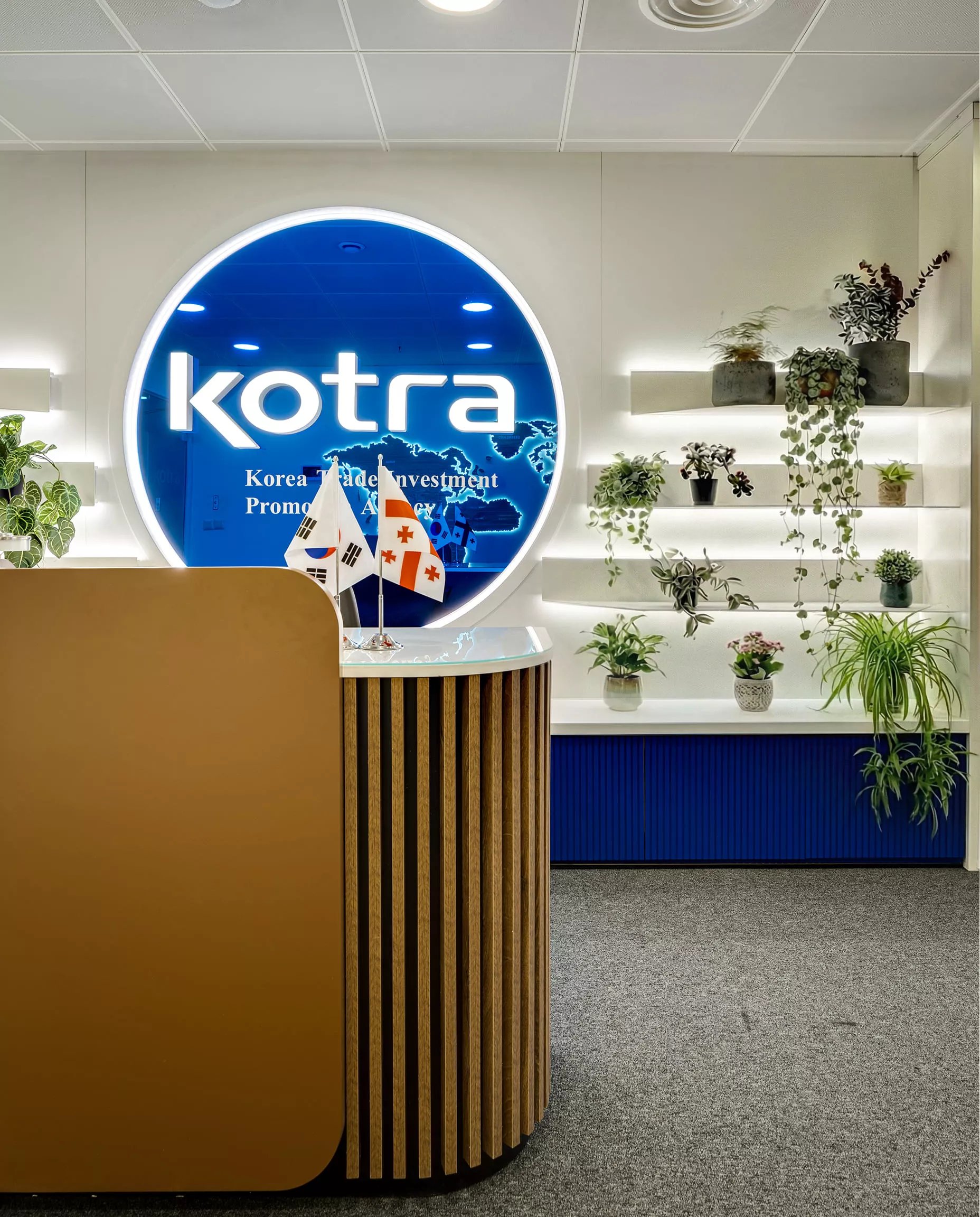
Office interior design - KOTRA Tbilisi
Interior
Interior design - country house project
Interior
Interior design with Scandinavian style accents
Interior
Common room design
Interior
Georgian Winery Interior Design
Interior
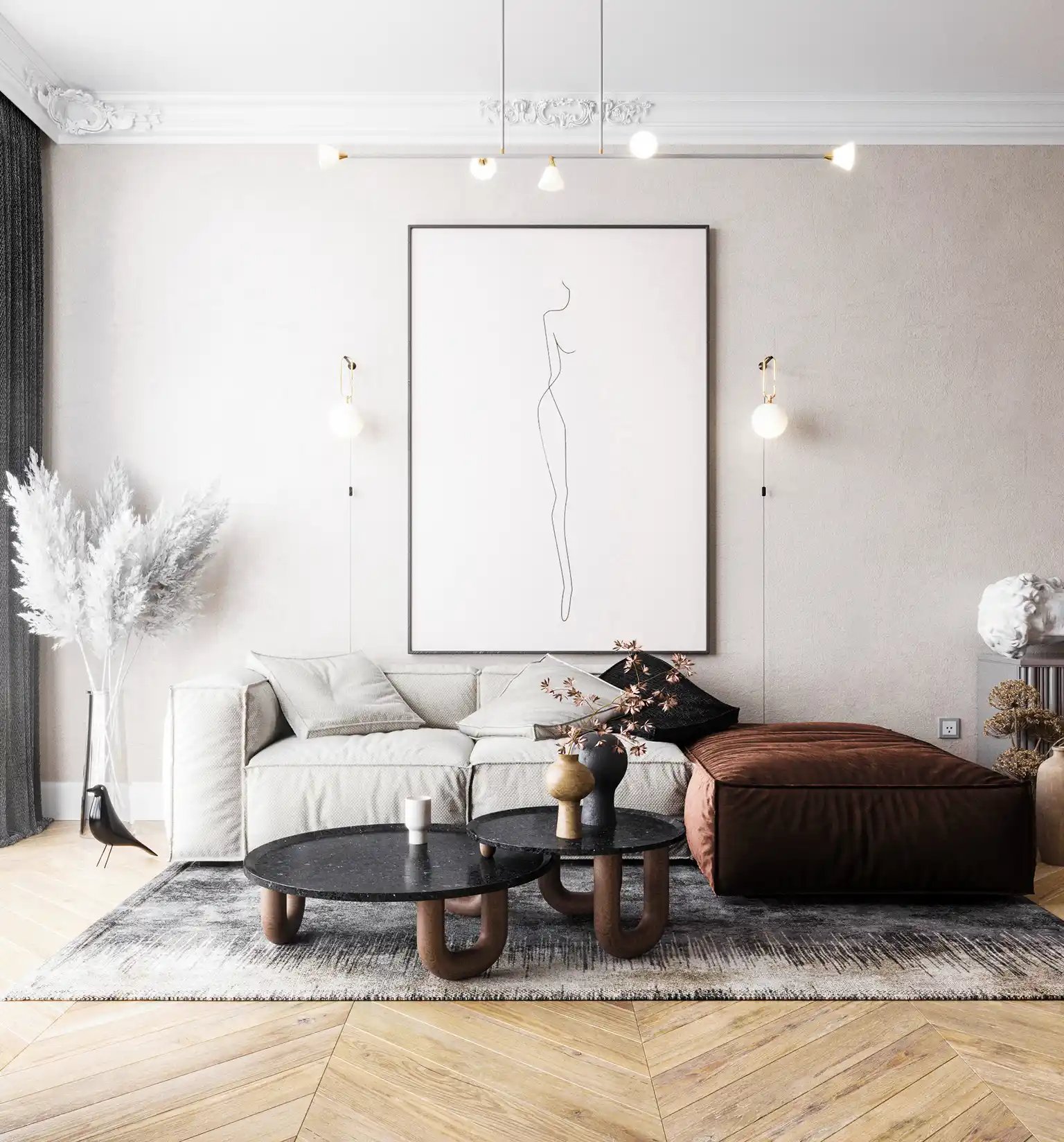
Minimalist interior design
Interior
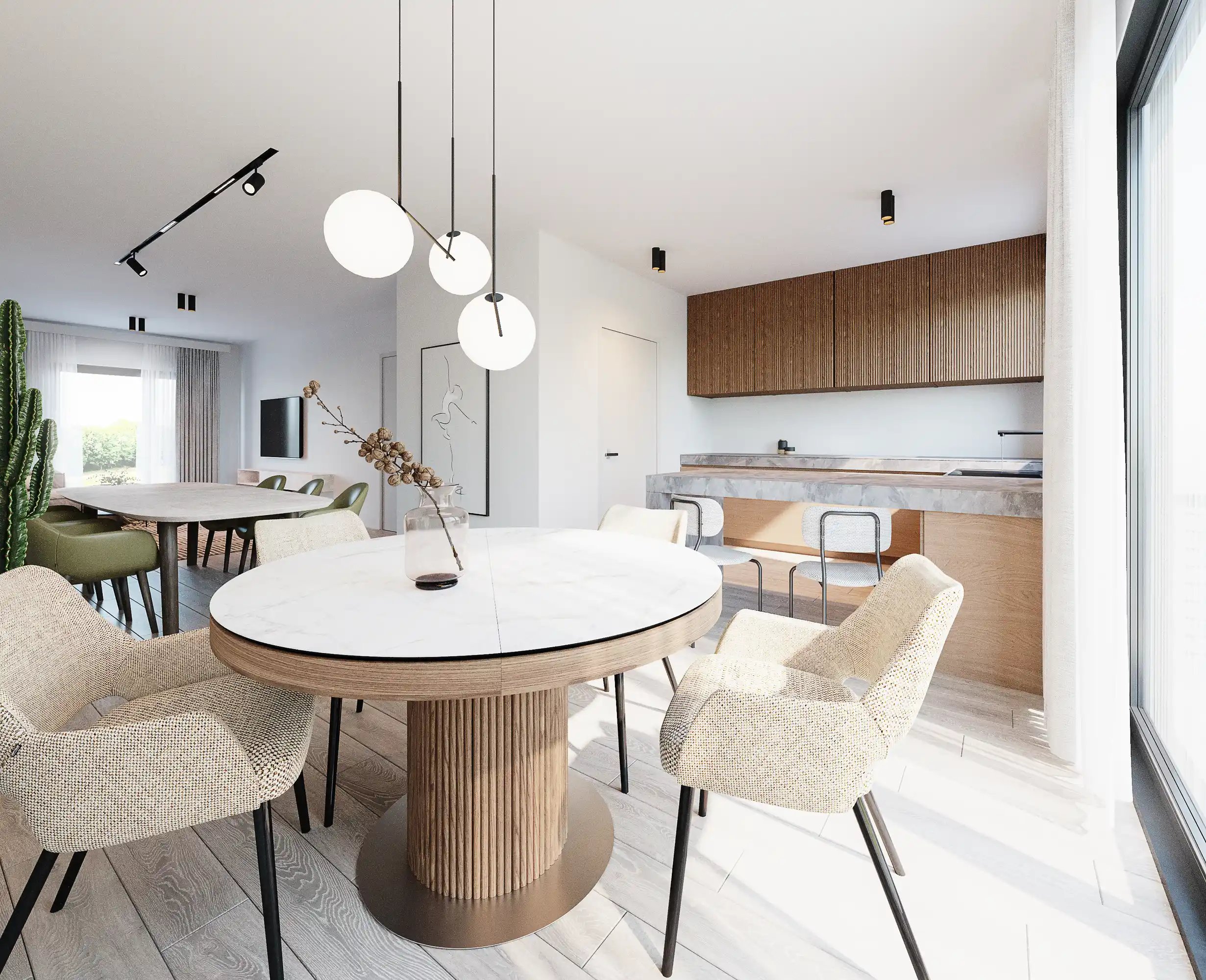
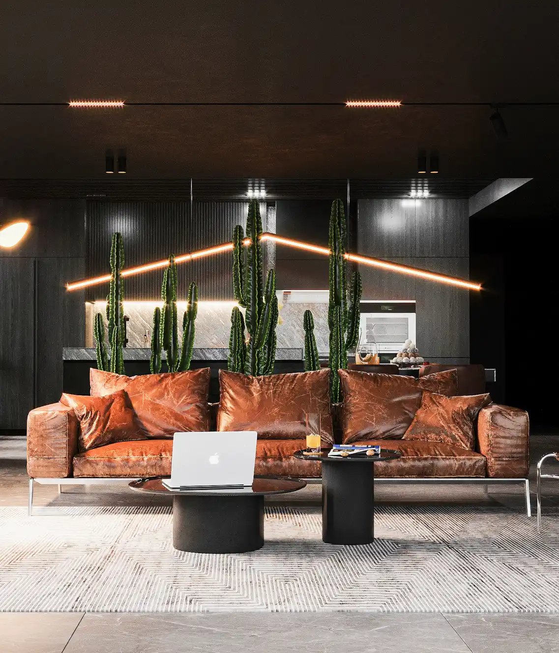
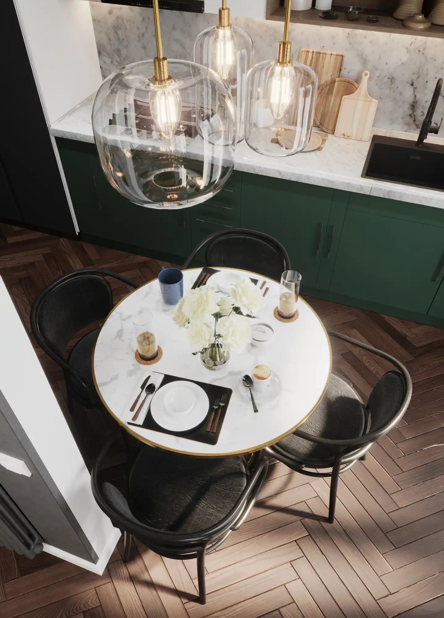
Living room and kitchen design
Interior
Residential house design
Interior
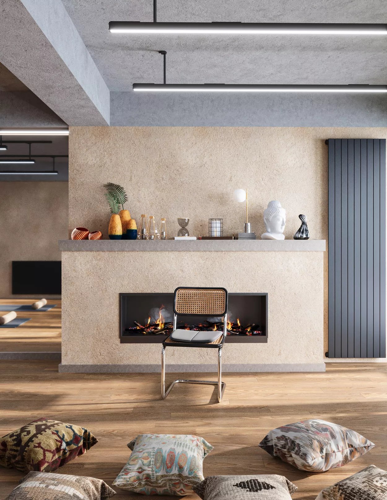
Yoga interior design on Bakhtrioni Street
Interior
Interior design with classic accents
Interior
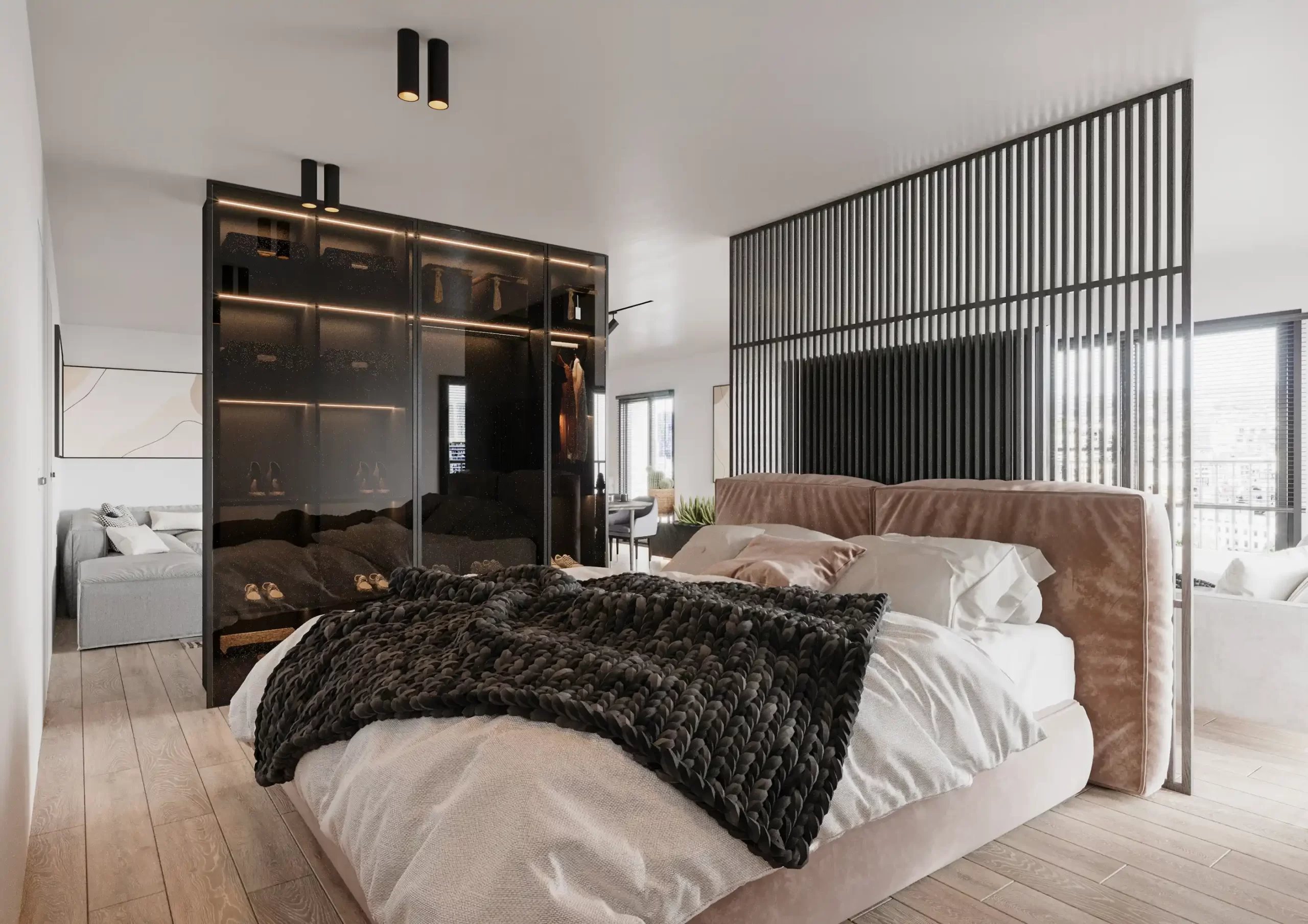
Interior design of a modern apartment in Didi Digomi | Dark style
Interior
Cozy apartment design
Interior