
Commercial
Lobby and Common Areas Design in Saburtalo, Tbilisi
A lobby, two floor halls, a stair core and a terrace for Zygma Saburtalo - one design language across five spaces, Tbilisi, 2026
- Category
- Commercial
- Year
- 2026
- Location
- Tbilisi, Saburtalo
- Area
- 185 მ²
- Client
- Zygma
01 - Challenge
The evaluation of an apartment starts at the building's threshold. Before a future resident glances at the view or studies the floor plan, they first have to cross the lobby, wait for the lift and turn into the corridor of their floor. It is in these few dozen metres that the main thing is decided: whether a person feels they have come home, or has simply stepped into another concrete building.
For the developer Zygma, the 30-storey mixed-use complex Zygma Saburtalo, now under construction in Saburtalo, Tbilisi, is the first project. And a first project carries special weight on the market: here the common areas are no longer just an entrance hall, they are the company's first physical promise and its calling card. Our task was to tie five such spaces - the lobby, the office and residential floor halls, the stair core and the terrace, 185 m² in total - into one story.
The complex already had its own visual identity - dark green, terracotta, cream and the distinctive Z mark - and that language had to continue inside. The main puzzle, though, turned up in the drawings: the lobby is a narrow gallery stretched over roughly 3 × 14 metres, where a classic wide hall physically does not fit.
Working with the Zygma team is a story of its own, and it shaped the quality of the project to a large degree. From the very first meeting the client knew what mood should meet a person walking into the building. Each of their comments was guided by taste and knowledge of the craft: instead of a vague "something is off", we always knew exactly what, where and why. Most importantly, once something was agreed, nobody questioned it again. When a process has this much trust and consistency, all of the designer's energy goes into perfecting the idea rather than reworking what has already been accepted.
02 - Approach
When designing common areas, the easiest temptation is to make an impression with expensive decor. We chose a different path: the brand's character had to be conveyed less through furniture than through the texture of the walls, the lighting and the wayfinding. After all, the feeling of a refined environment is not created by the price of a material - it comes from well-directed light and precision in the details. This approach is called neuroarchitecture, and it is the foundation of every project we do: each decision about a space rests on what research says about the human brain and body, not on taste alone.
1. One palette, five doses
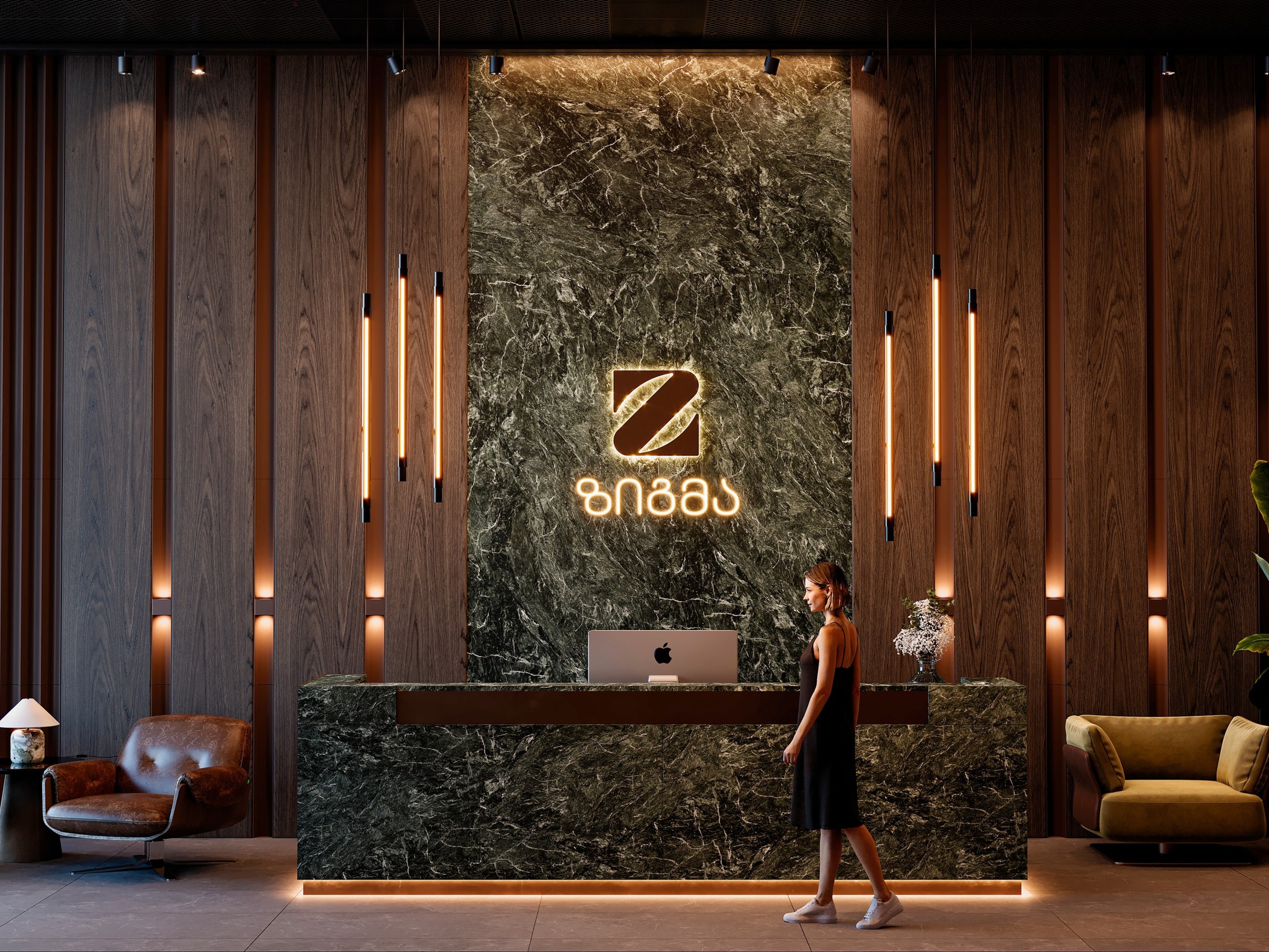
So that we would not end up with five disconnected interiors, we distilled a single formula from the brand catalogue: a dark green and chocolate shell, warm terracotta accents, soft linear light and one memorable detail in every space. Unity, however, does not mean monotony: in the lobby this palette sounds at full strength, in the halls it changes character with the purpose of the floor, in the stair core it softens into a calm echo, and on the terrace it steps out under the open sky.
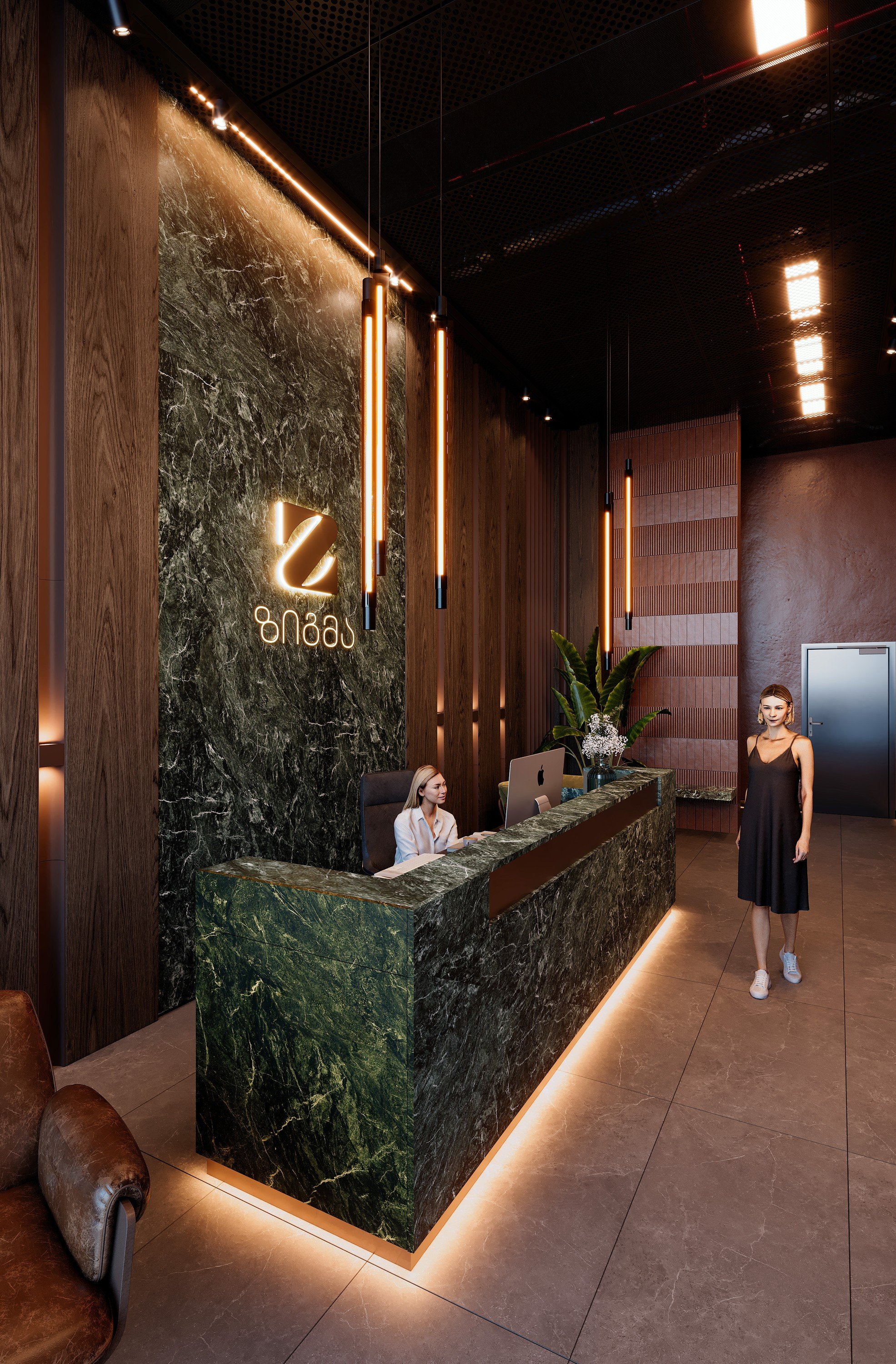
We kept the same restraint with the texture of wood. A year-long observation carried out in Austria showed that people in a room finished in solid wood had a lower heart rate and fewer signs of stress. Yet an intriguing experiment by Japanese researchers made clear that more is not always better: when people were asked to compare three rooms - with no wood, with 45% and with 90% wood cladding - the middle option turned out to be the most comfortable. Too much texture weighs a space down. So we kept wood only where the eye naturally rests and the hand touches: at the lobby reception desk and the waiting area, and on the wooden door frames of the office hall; in the residential halls and the stair core we preserved the calm with textured plaster and bronze details.
2. The lobby - a narrow gallery that moves with light
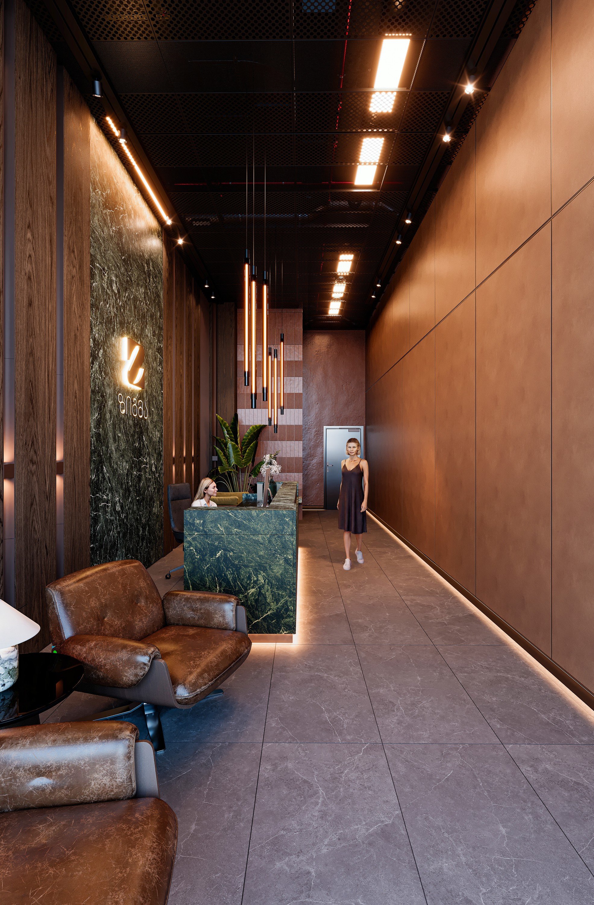
In a width of three metres you cannot fit a classic, open hall - fighting the space makes no sense, its geometry has to be turned to your advantage. So we built the whole drama on length and perspective.
Coming in from the street, nothing stands in your way: the entrance is free across its full width, and in the very first second the eye is caught by a monolith with the texture of green marble rising at the end of the gallery, with an illuminated logo. This one strong accent ties the whole corridor together and adds depth. The reception desk, clad in the same texture, we placed in the middle section along the wall, so the concierge sees both the entrance and the lift zone at once. Nine vertical pendants dropping over dark wood panels give the movement a calm rhythm, and we aligned the black metal grid of the ceiling with the joints of the floor tiles - the eye reads this geometric order subconsciously, and even in a narrow space you feel balance.
3. The halls - the floor's character at a glance
In multi-storey buildings people move by an interesting principle that researchers call the "floor strategy": first you automatically go up to the floor you want, and only after stepping out of the lift do you start looking for the specific door. When every floor is identical like twins, the brain has to orient itself in the environment anew each time.
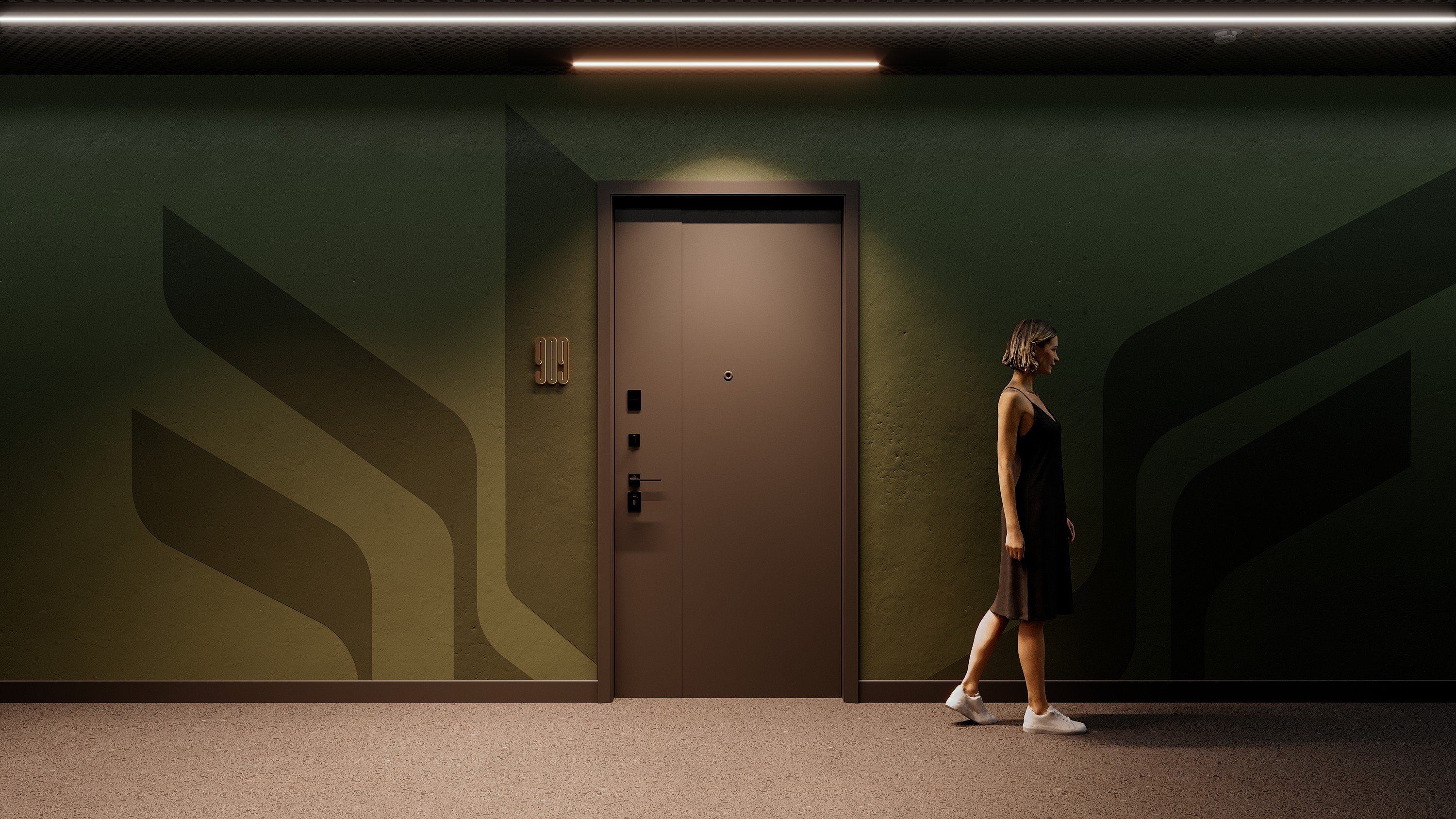
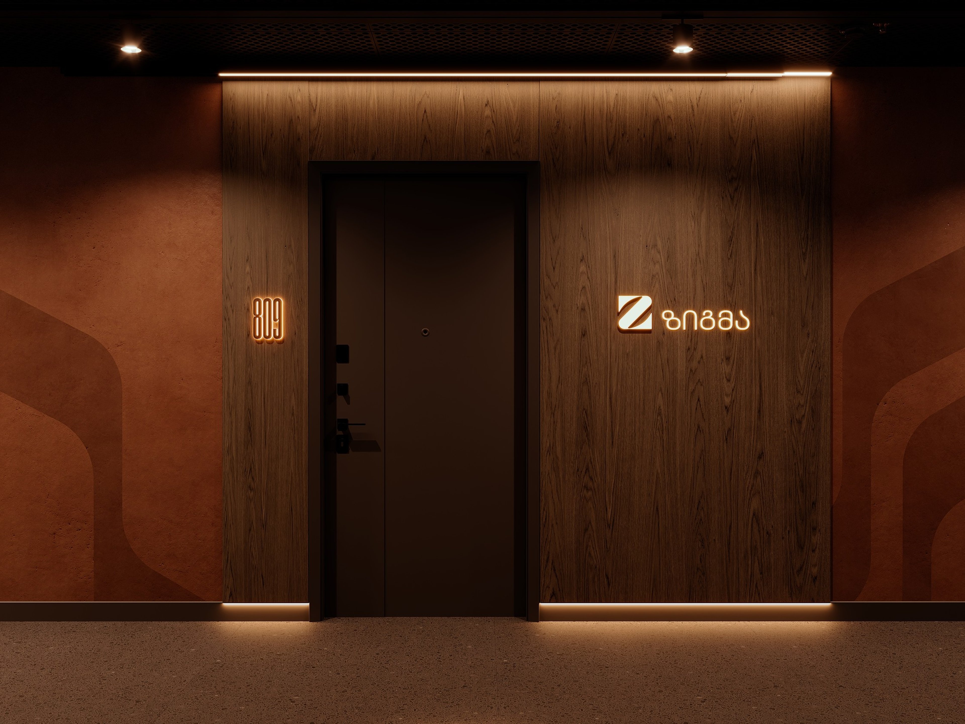
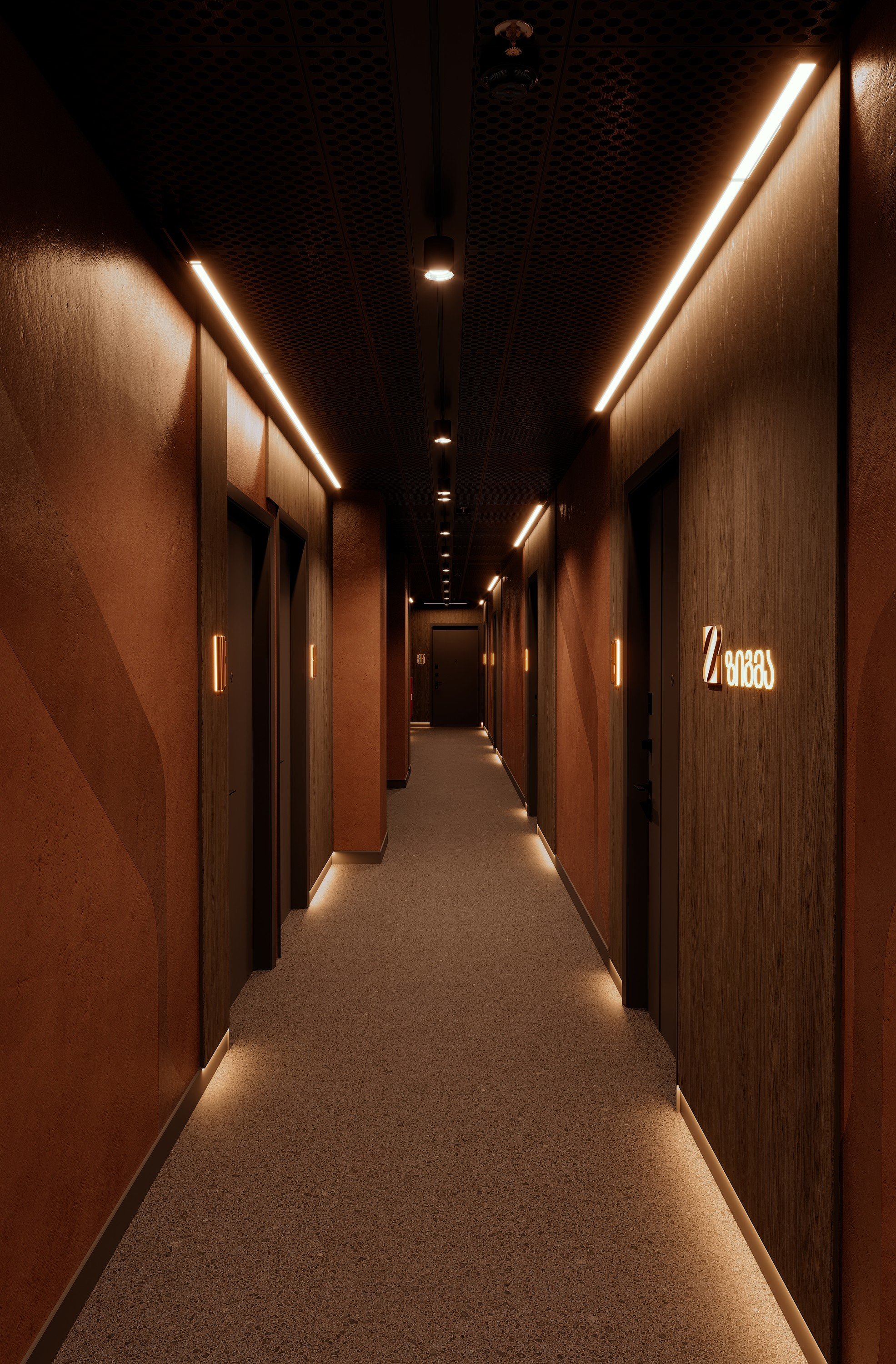
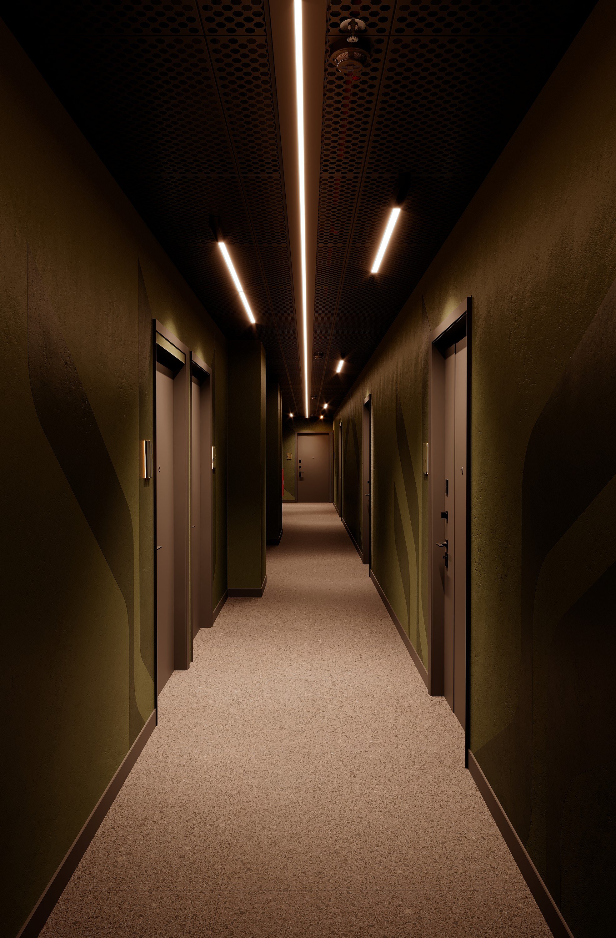
So we kept a shared handwriting for the office and residential halls but gave them entirely different moods: on the office floors you meet energetic terracotta and warm wooden door frames, on the residential floors - deep, calm green and bronze. The lift door opens and, before you read a number, in a hundredth of a second you know whether you have arrived in the business part or the residential one. Each door has its own lighting and an illuminated number, which makes finding your way along the corridor easier, while the brand's Z-wave running along the walls is done in the same tone as the background - the identity is visible but never tires the eye.
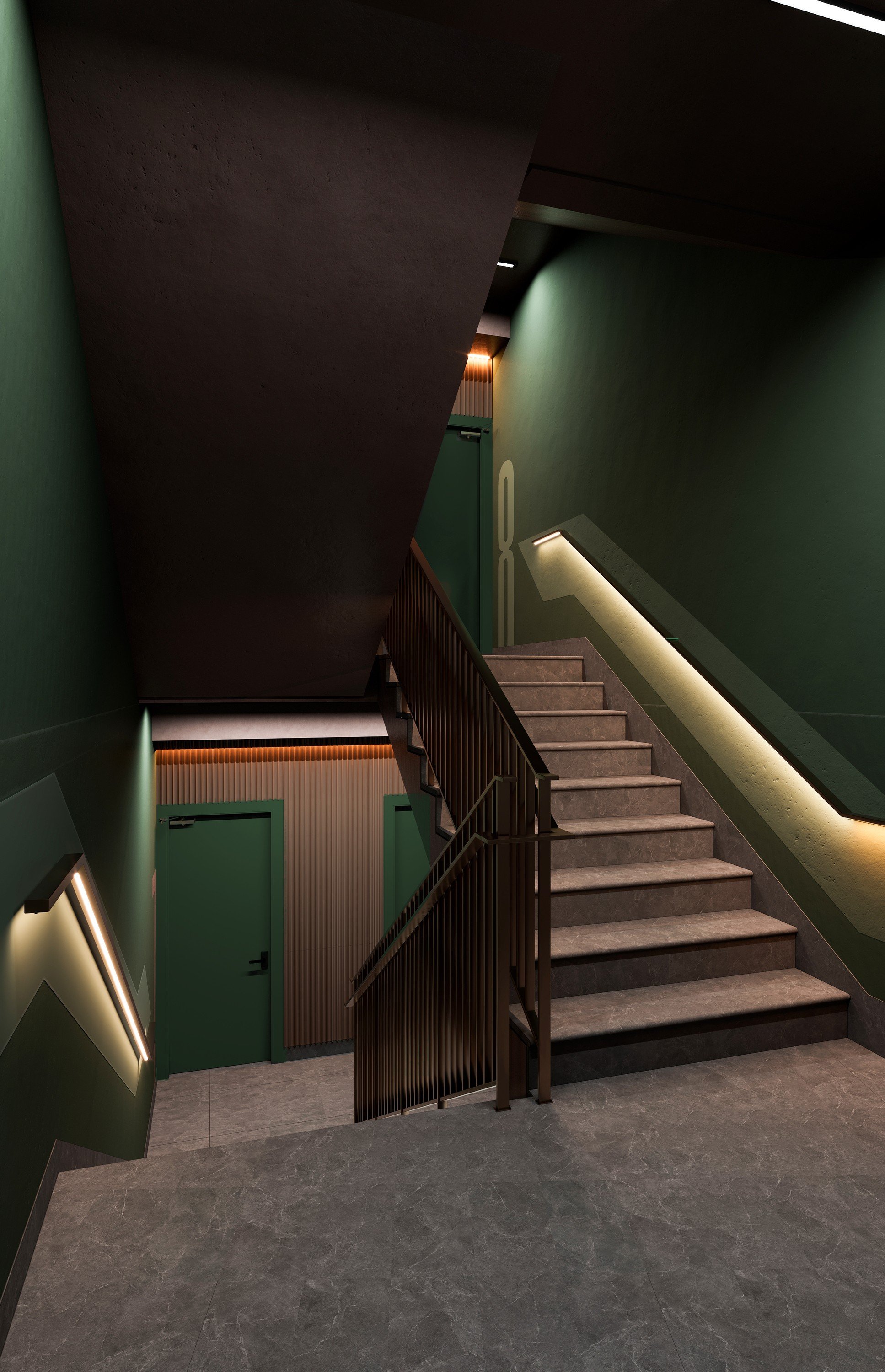
4. A stair you will want to climb
In almost every modern building the escape stair shares one fate: cold concrete, grey walls and the feeling that you should only come in here when the alarm goes off. And yet an observation in a university building showed something simple: when only encouraging signs were put up in the stairwell, almost nothing changed, but as soon as the space itself was made aesthetically pleasing, the use of the stairs rose noticeably.
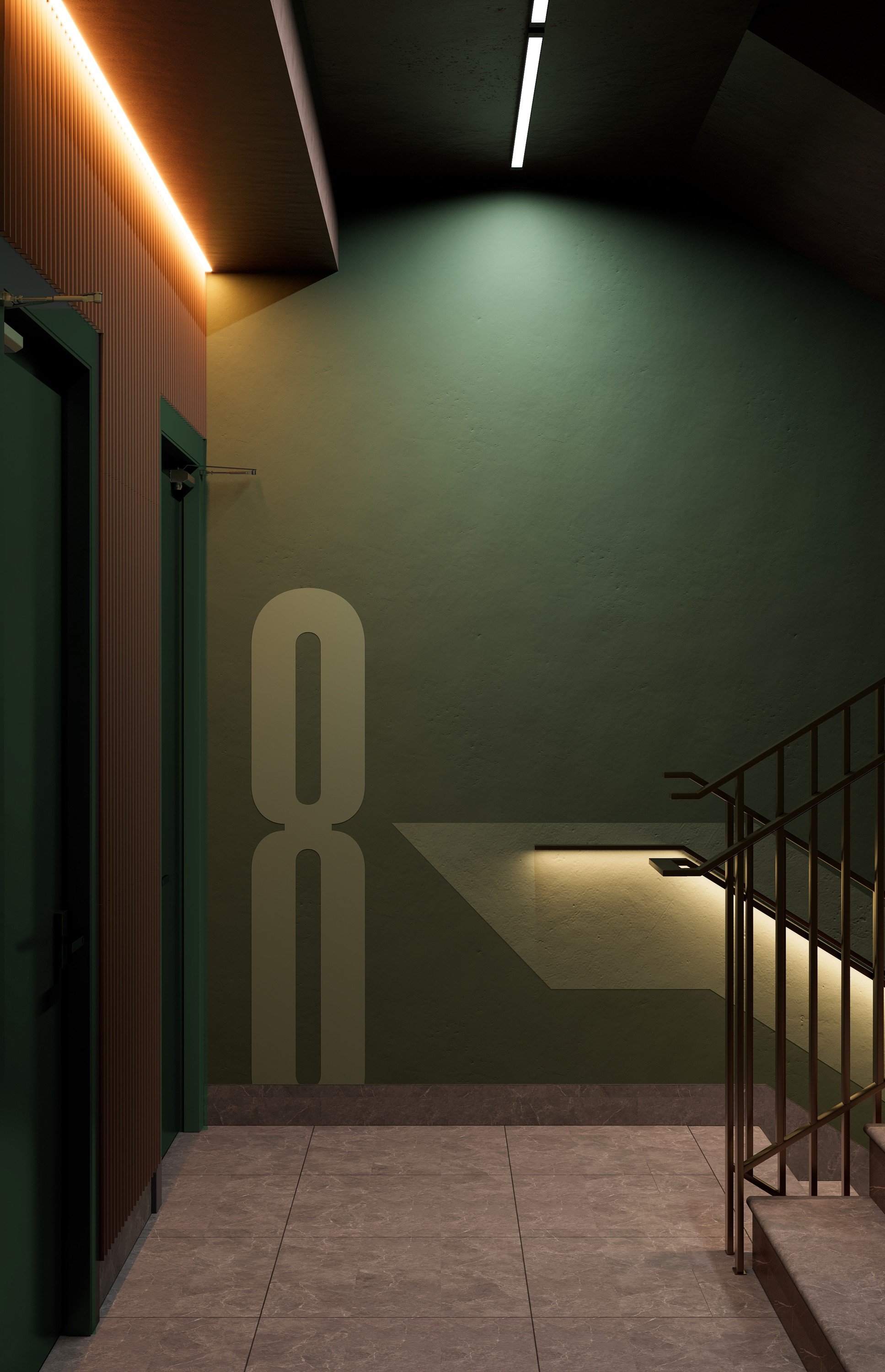
We too decided not to leave the stair core as a "back yard" and made it a natural continuation of the lobby. Even within the strict escape-stair codes we managed to bring in character: on the brand's dark green walls we placed large cream floor numbers, and into the lower profile of the bronze-tone handrail we set a warm LED strip. The light follows you exactly where your hand holds on - it is both safe and cosy. We planned precisely the kind of stair that a person chooses even when they do not have to.
5. The terrace - a prototype that repeats
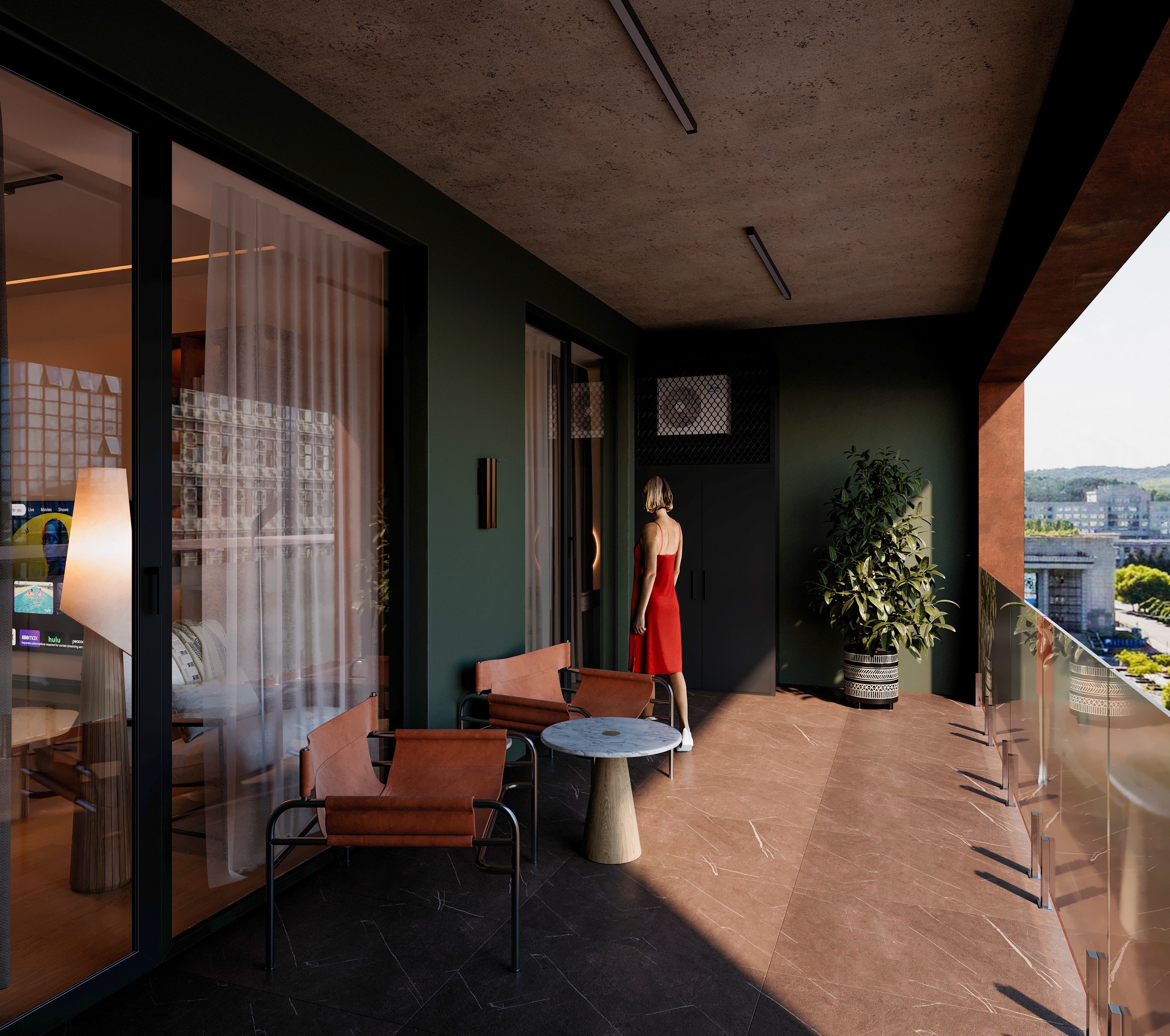
The 17.4 m² terrace on the office floor had a double role from the start: for staff it is a way out into fresh air, for the developer - a test module for the whole building.
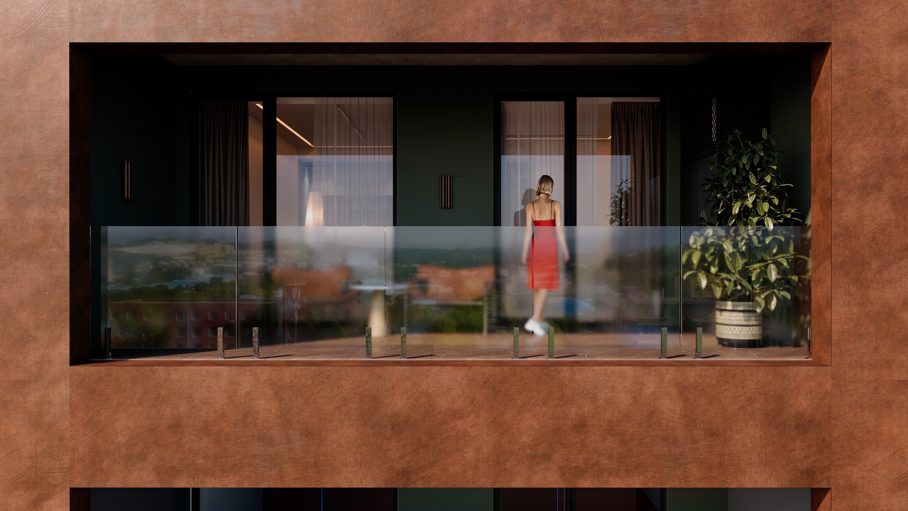
So we turned down complex one-off structures and created a laconic, durable and easily repeatable environment: dark green walls, a concrete-texture ceiling with soft linear light, light furniture that is easily brought indoors in winter, and one clear accent of a living plant. Every detail was drawn so that Zygma can carry this solution over to the complex's other terraces as a ready standard, without extra rework.
6. Light that follows the rhythm of the day
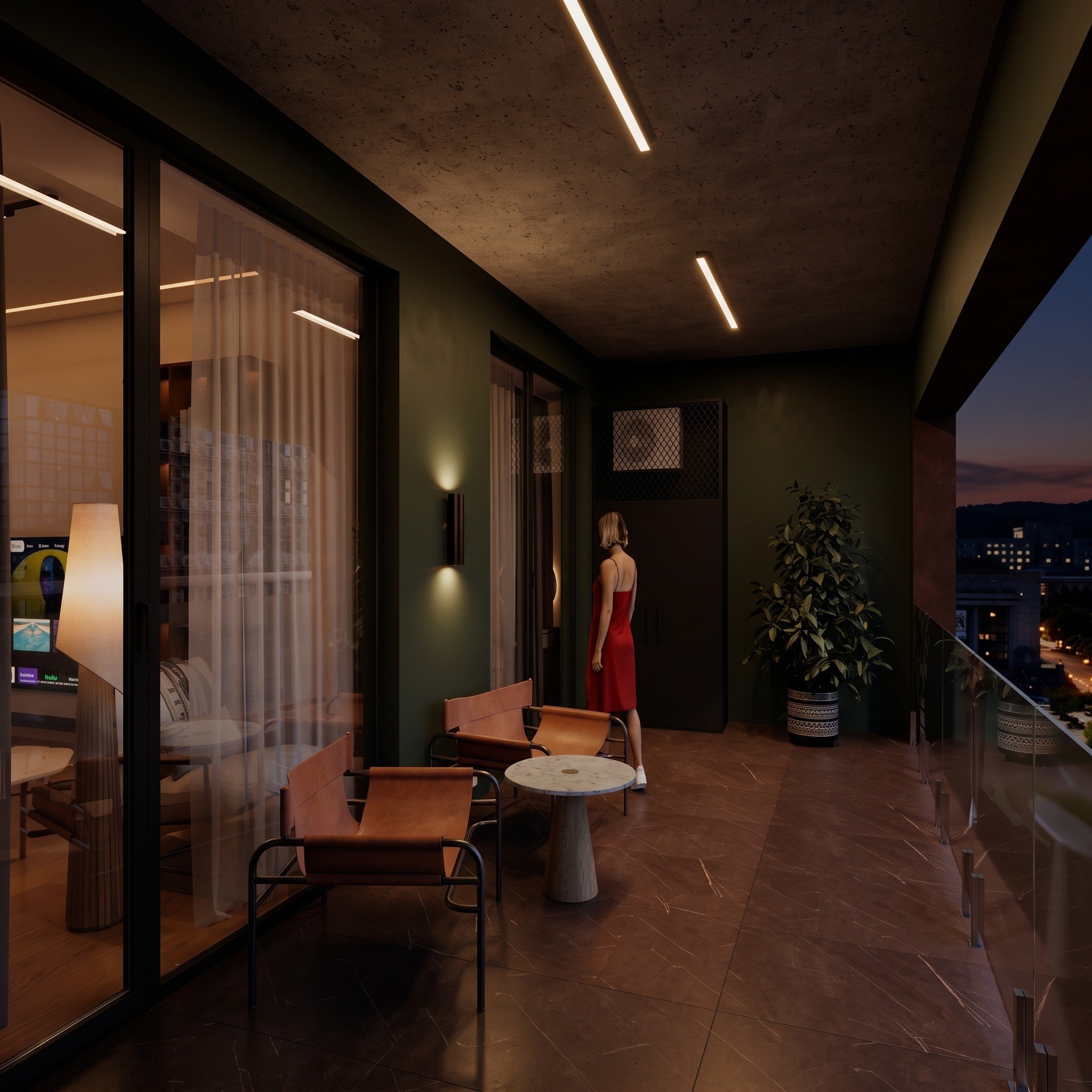
In the entrance halls of residential buildings one strange mistake keeps repeating: harsh, cold ceiling fixtures shine the same way at any hour of the day or night. But our biological clock does not work like that - according to research on circadian rhythms, during the day the brain needs at least 250 melanopic lux at eye level to stay alert, and in the evening less than 10, that is, light twenty-five times softer.
Since the common areas of a mixed-use complex are active both during the day and late at night, one unchanging ceiling light could not serve both modes. So we gave up the glaring brightness poured down from the ceiling, split the lighting into several layers and brought the main accent down to the lower level. The scenario was planned accordingly: during the day the space is bright and energetic, while in the evening, someone returning home after a working day is met not by an office floodlight but by a calm, warm glow that sets the body up for rest in advance.
03 - Result
For a developer, a common area is always a double equation: at the sales stage it has to convince the buyer, and after handover it must not turn into a constant repair cost. In the Zygma project we answered both tasks with one principle: every point a person touches daily - the handrail, the door frame, the illuminated number or the lower zone of the wall - is designed for heavy wear; and the places that are often treated as secondary - the corridor and the stair core - we turned into a fully fledged architectural environment, where the resident feels every day what kind of building they live in.
The complex is now at the stage of active construction, and the construction team has a complete design guide in hand - visualisations, working drawings, a materials specification and a bill of quantities. How our narrow gallery works under real foot traffic, and how the terrace module spreads to other floors, the finished building will show - and we will certainly share the continuation of this story right here.
Buying an apartment or an office in Zygma Saburtalo? The collaboration did not end with the handover of the project: Fillet Studio is Zygma's official interior design partner. Owners of apartments and office spaces in the complex will have special terms on our design project with the Zygma Card, and the unified language that starts in the lobby will continue inside the apartments themselves - interior design.
We consider this project one of our most distinctive commercial works, and that is no accident: a strong result is always born where the client knows the goal precisely and the architect has the freedom to reach that goal with scientific knowledge. The dosing of wood, the colour of the floors, the lighting of the handrail or the soft evening light - every decision here rests on neuroarchitectural research. For Fillet Studio, a person does not read a space with the eyes alone: in all of our residential and commercial projects we create the environment for the whole sensory system - with tactile texture, the natural smell of materials, acoustic calm, soft forms and the rhythm of light. This is what caring for people means to us, and it is our main design rule: first the human experience, then the visual effect.
Sources: Kelz, Grote and Moser (2011) - solid wood and stress, a year-long observation; Tsunetsugu and Miyazaki (Journal of Wood Science, 2007) - wood surface share 0 / 45 / 90 %; Hölscher et al. (Journal of Environmental Psychology, 2006) - the "floor strategy" in multi-level buildings; Boutelle et al. (American Journal of Public Health, 2001) - stairwell aesthetics and use; Brown et al. (PLOS Biology, 2022) - melanopic lighting recommendations for day and night.
Planning the common areas of a residential or mixed-use complex? See how our service works - commercial interior design - and why we base decisions on research - neuroarchitecture and psychology. A project done with a similar approach: IT office interior design.
Photo gallery
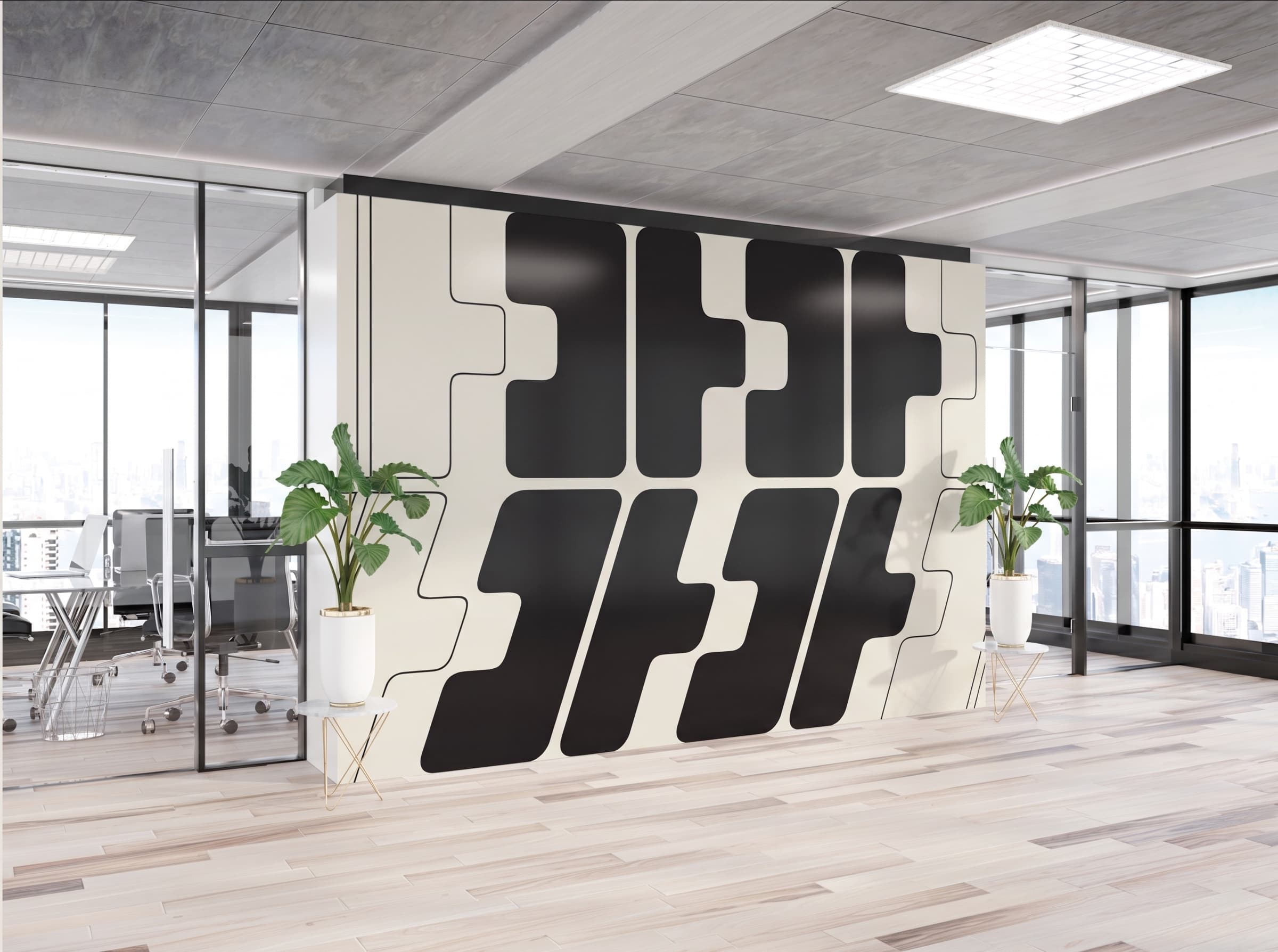
Take a look at the works
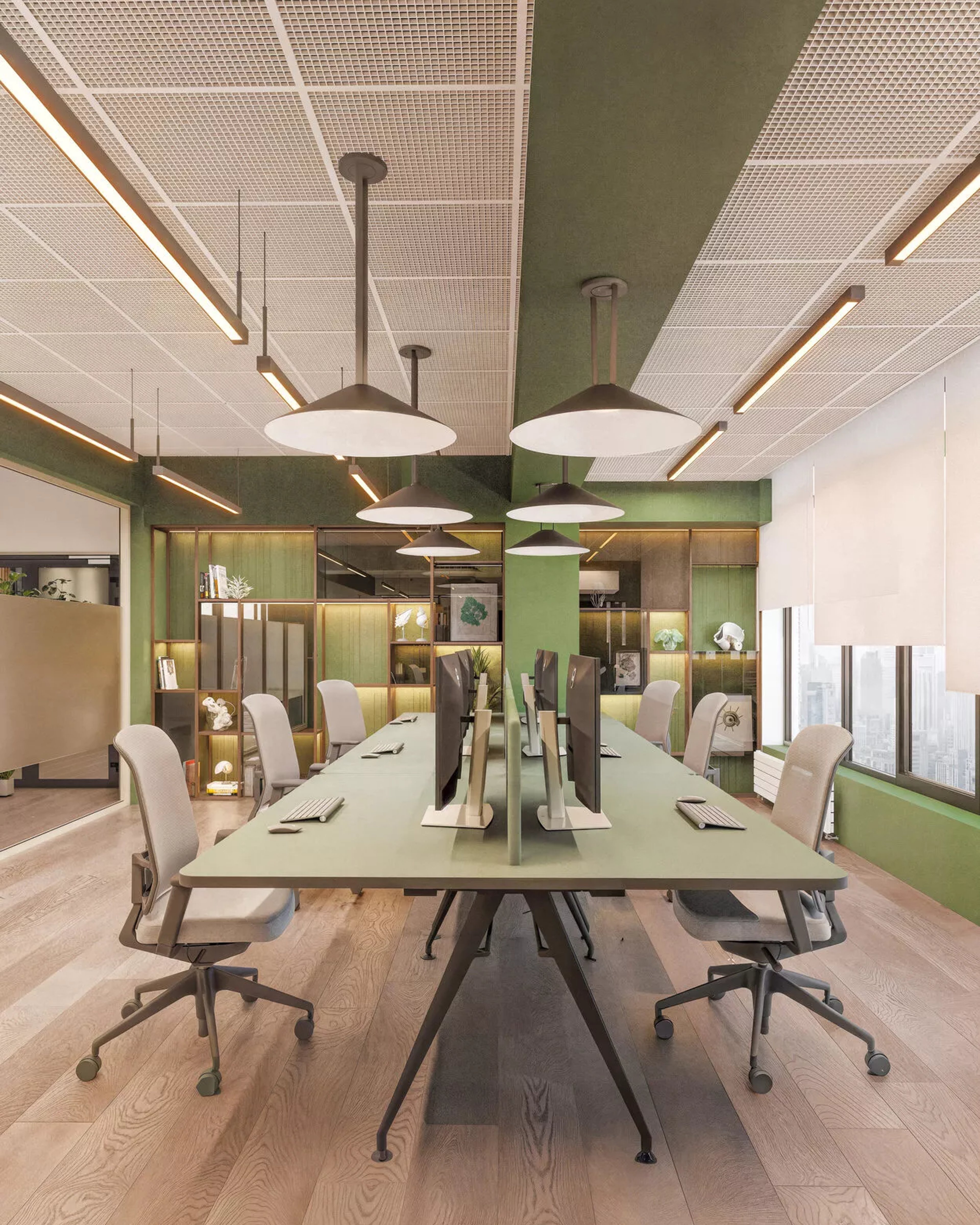
IT Office Interior Design
Commercial
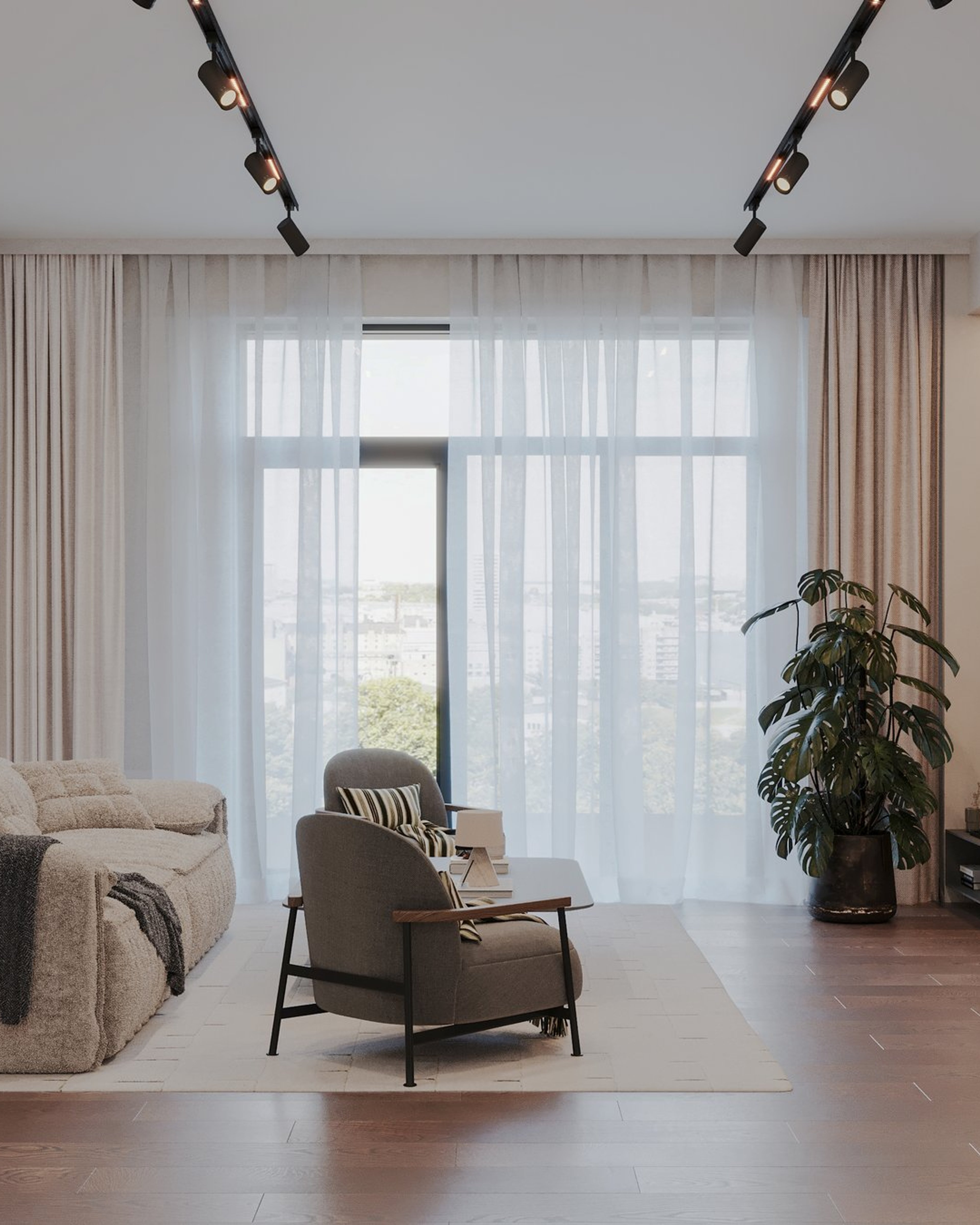
One-Bedroom Apartment Interior Design in Didi Digomi
Interior
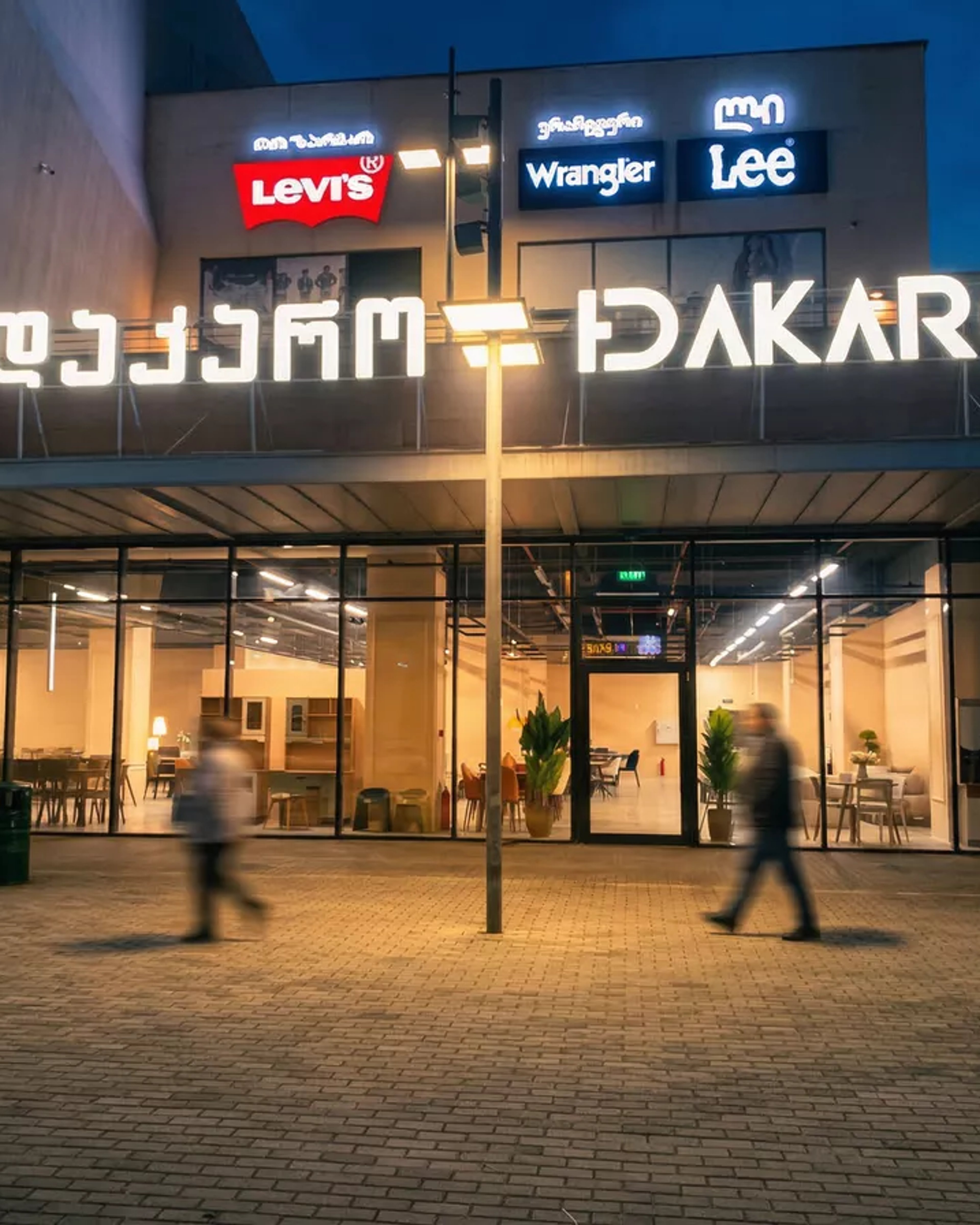
Commercial Interior Design | Furniture Showroom DAKARO
Architecture
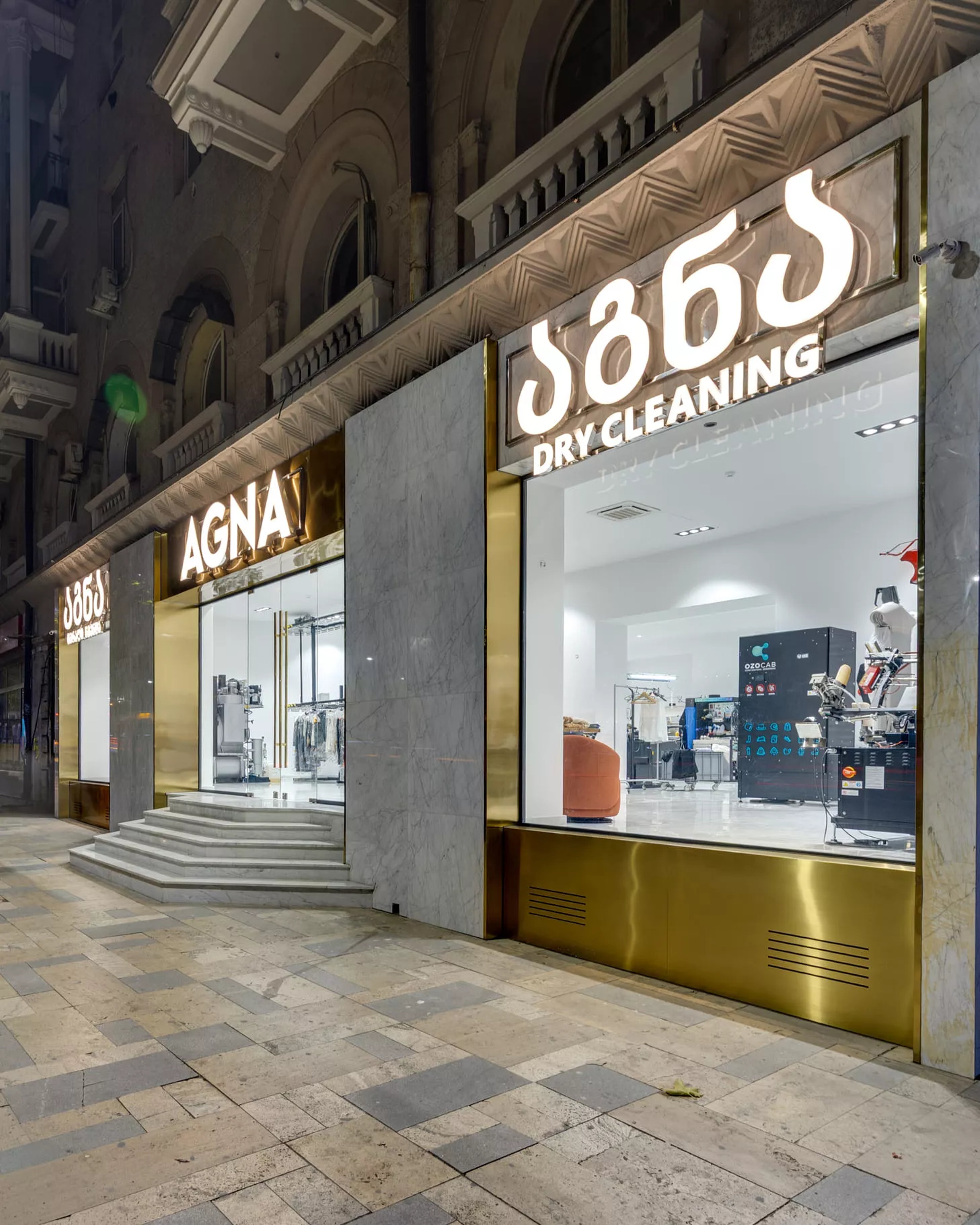
Commercial exterior and facade design
Architecture
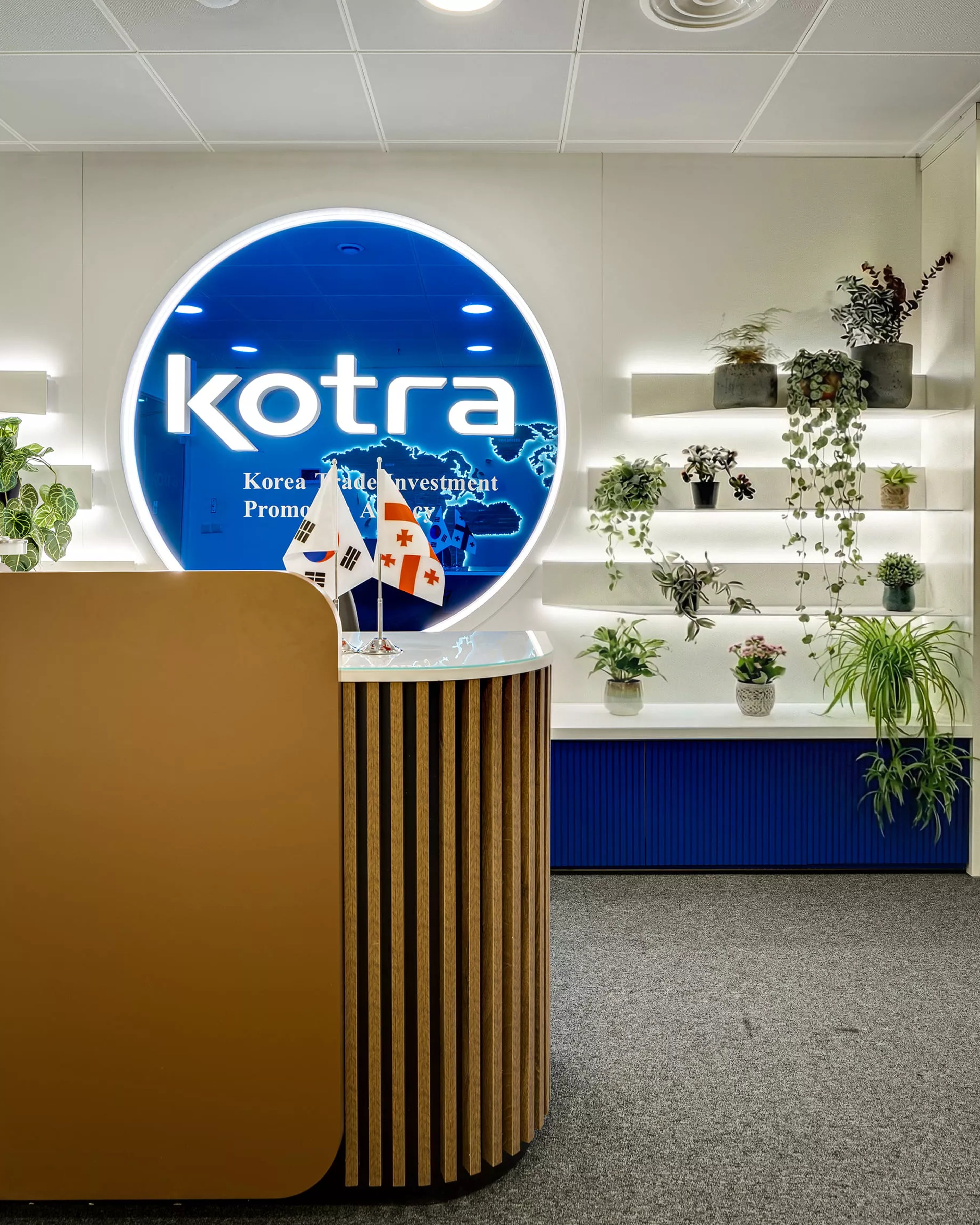
Office interior design - KOTRA Tbilisi
Interior
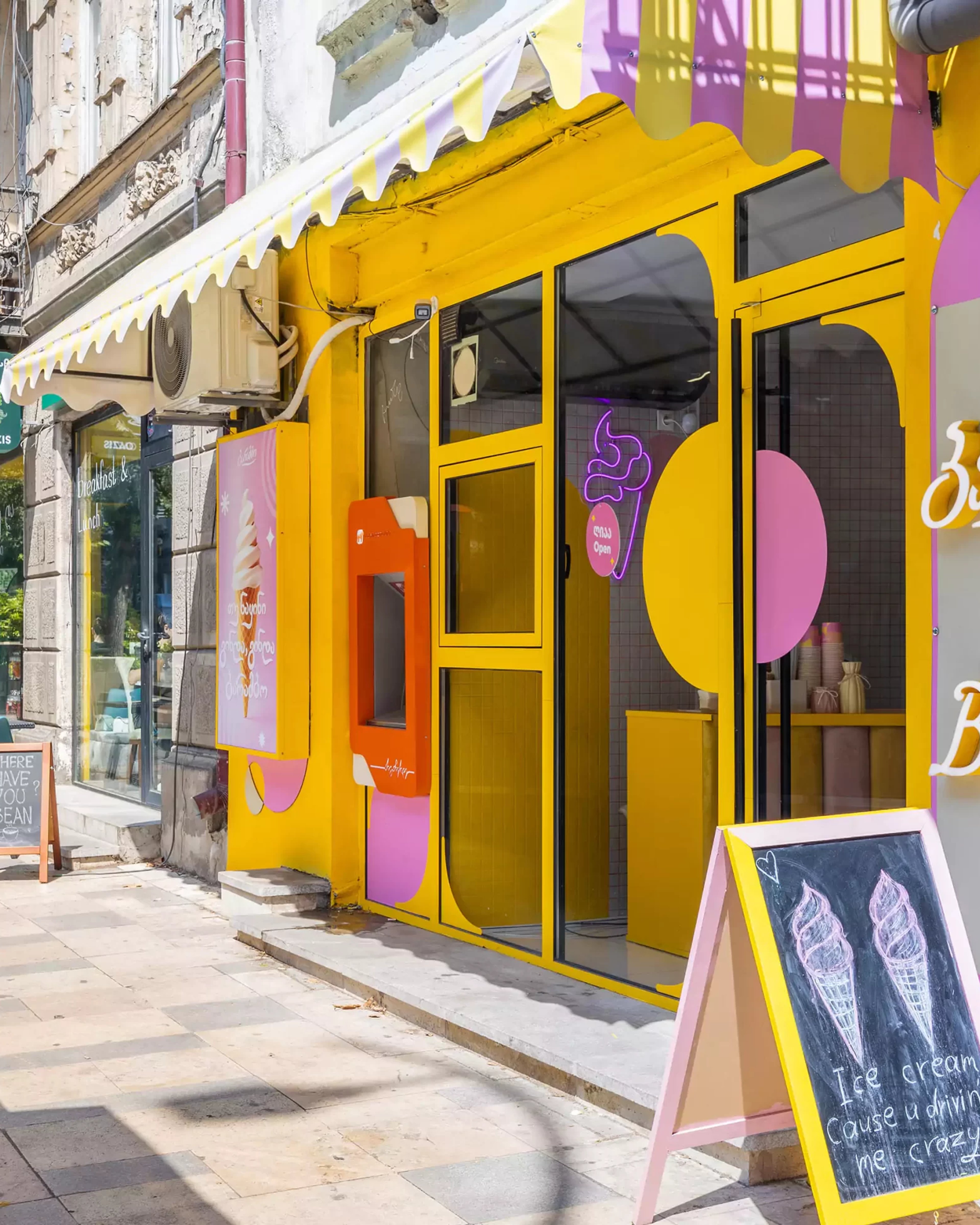
Barambo's Ice Cream Shop Interior | Commercial Design
Exterior
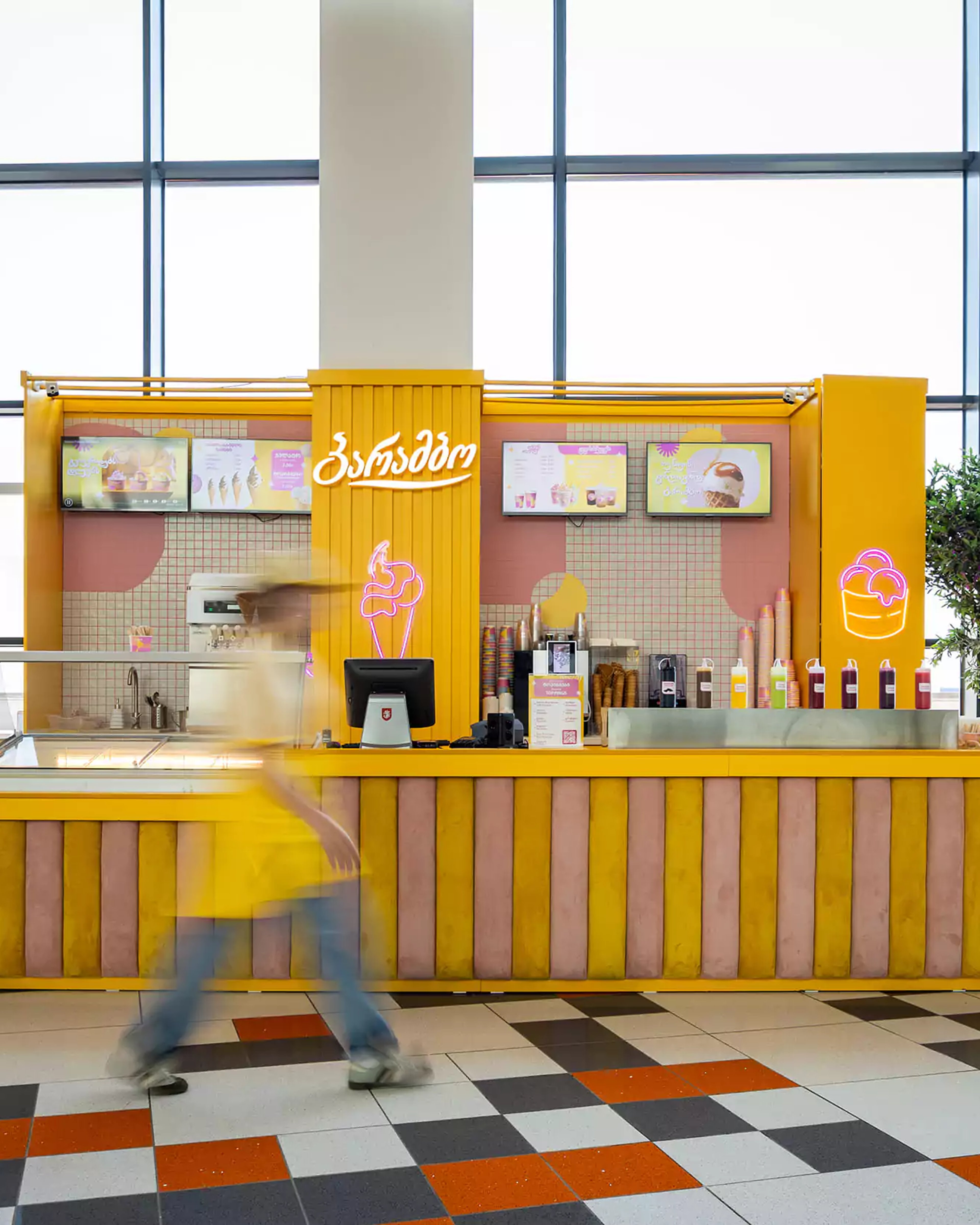
Barambo ice cream islands in shopping malls
Interior
Interior design - country house project
Interior
Interior design with Scandinavian style accents
Interior
Common room design
Interior
Private house design
Architecture
Georgian Winery Interior Design
Interior